When we look at the whole dataset it’s difficult to see who is actually at risk from COVID-19. The below graphs and analysis shows the data broken down into age groups showing the reality behind the pandemic shedding light on who is at risk.
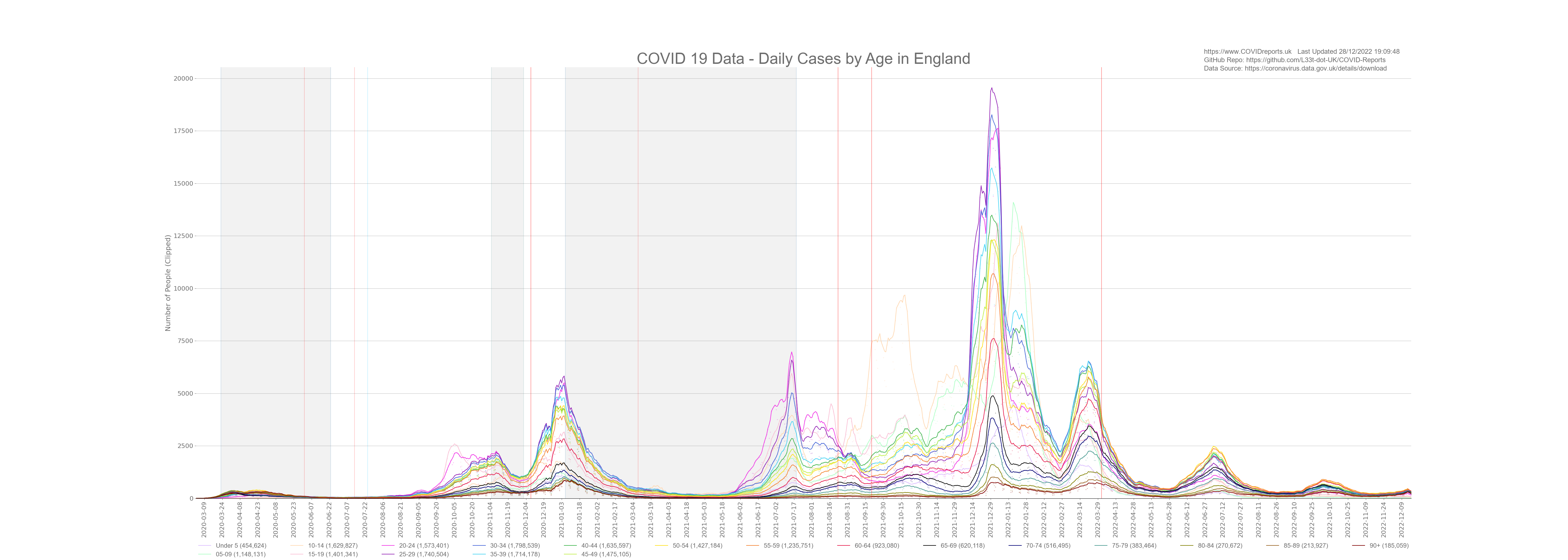
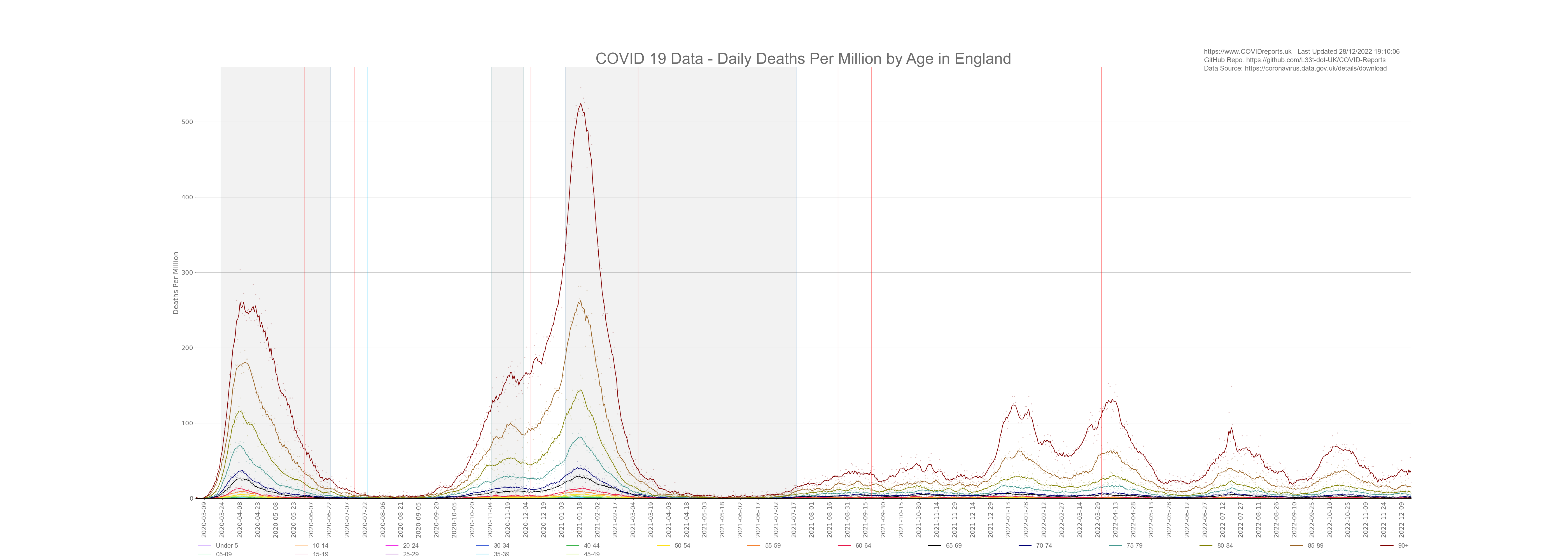
COVID-19 spread through the population of England and infected every age group. The below graph shows all age groups broken down into 5 year blocks and the number of cases in each age group is shown in the legend. Notice the increase in cases in the under 25’s at the start of October 2020 when they started surge testing in schools and universities, because most of these cases were in the young we did not see a corresponding increase in death.
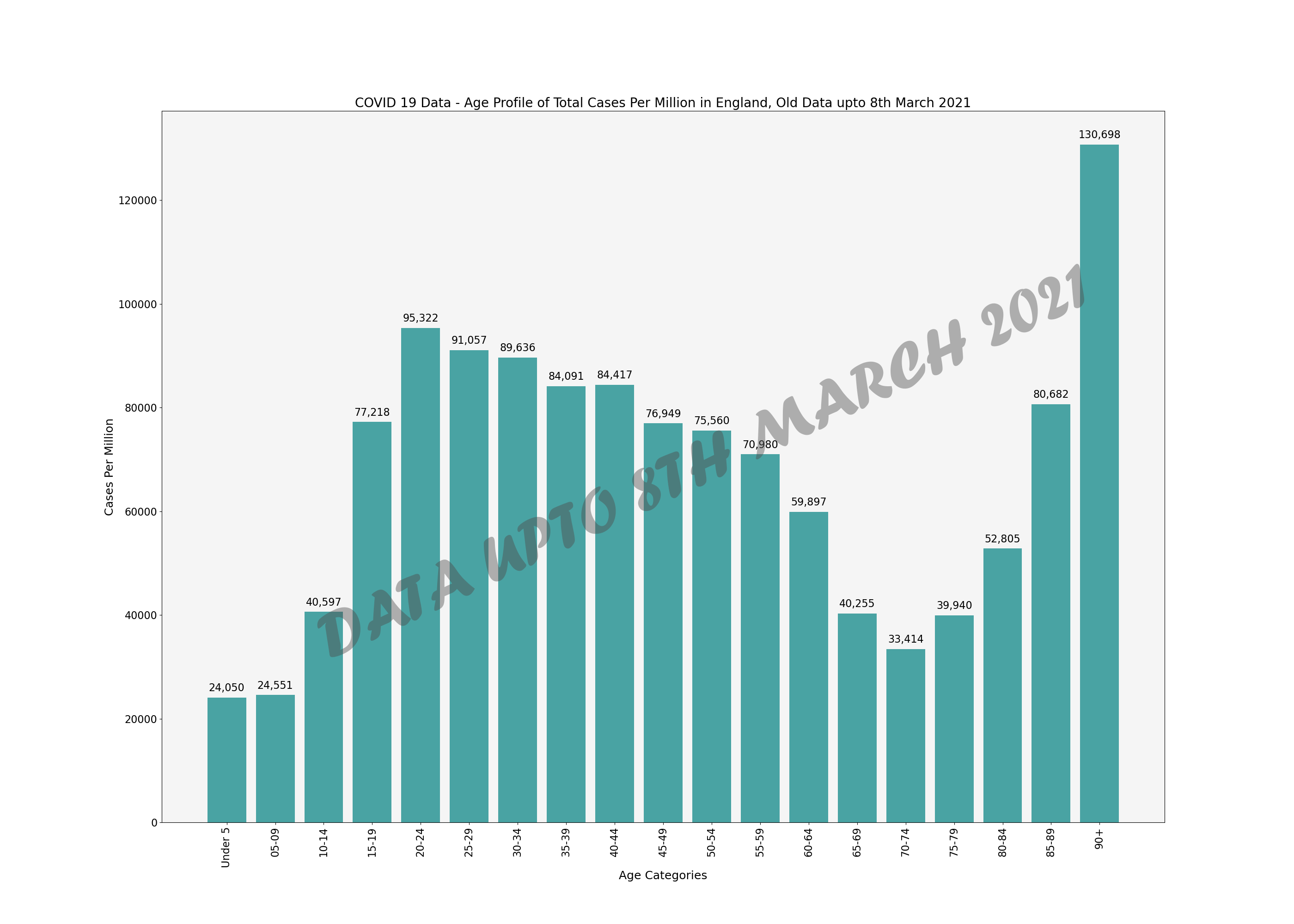
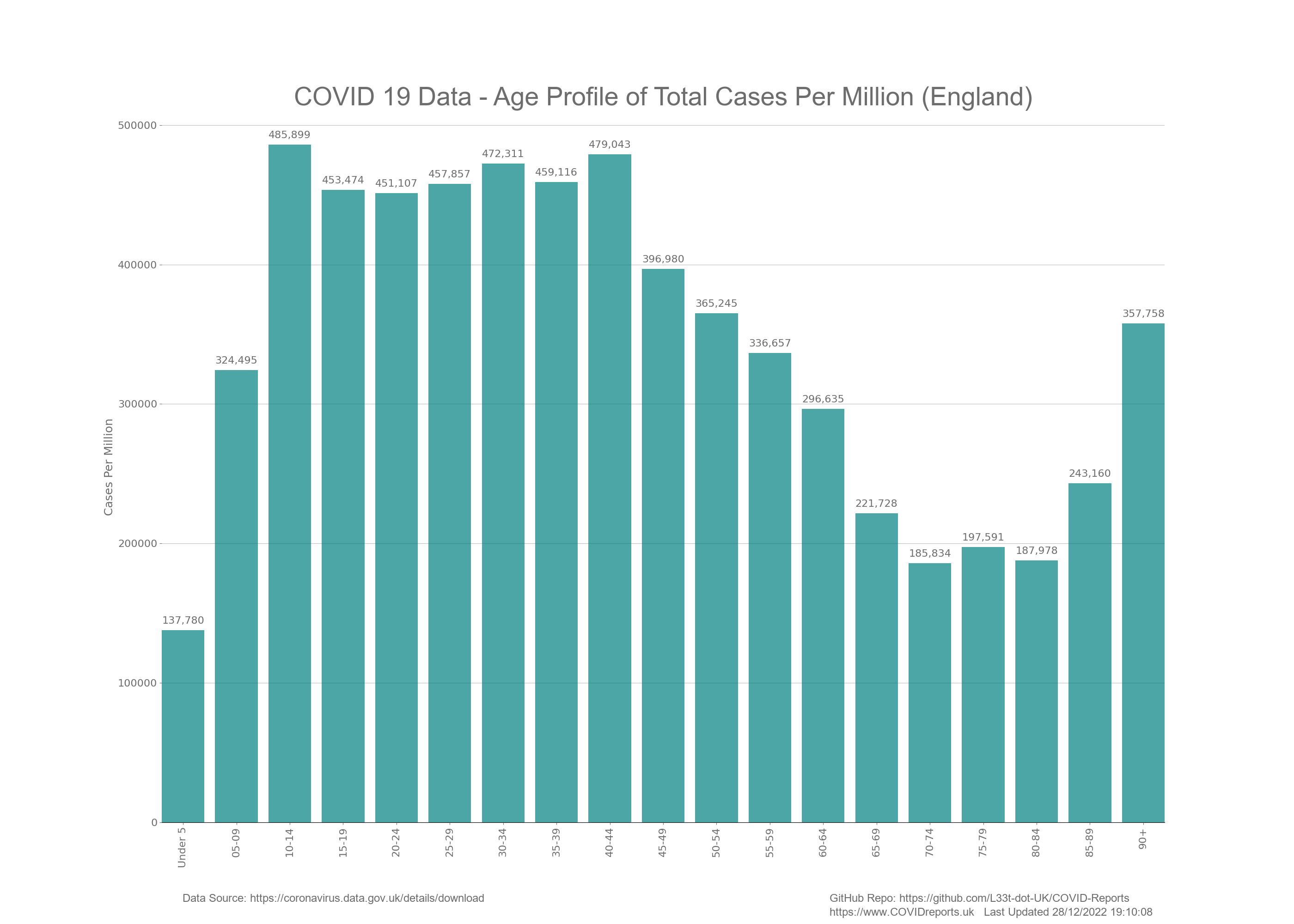
Lets look at the same data in a bar chart to see which age group has been affected by cases the most (not controlled for population).
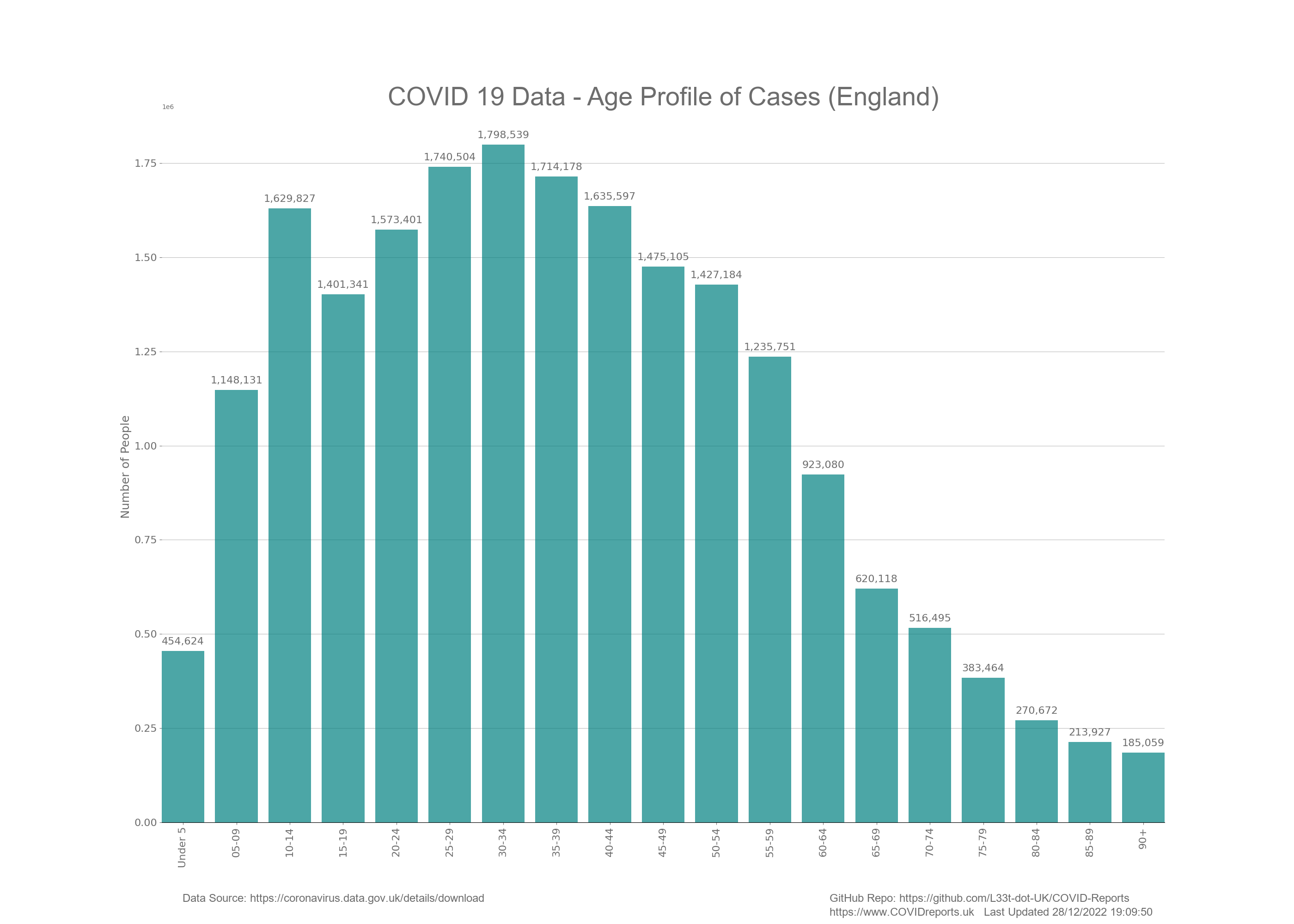
As you can see, most of the cases were in the younger portion of the population. This is what we would expect and shows nothing of significance considering testing policy. We would expect the younger age groups to have more positive cases as these make up the majority of the population and exhibit the most mobility. This does not mean that these groups are driving infection. If tests were conducted in a concentrated manor on symptomatic people only, this graph would look totally different. The fact of the matter is that testing asymptomatic people has resulted in a case profile that resembles the age demographic of England where we see the most cases in the more numerous mobile age ranges.
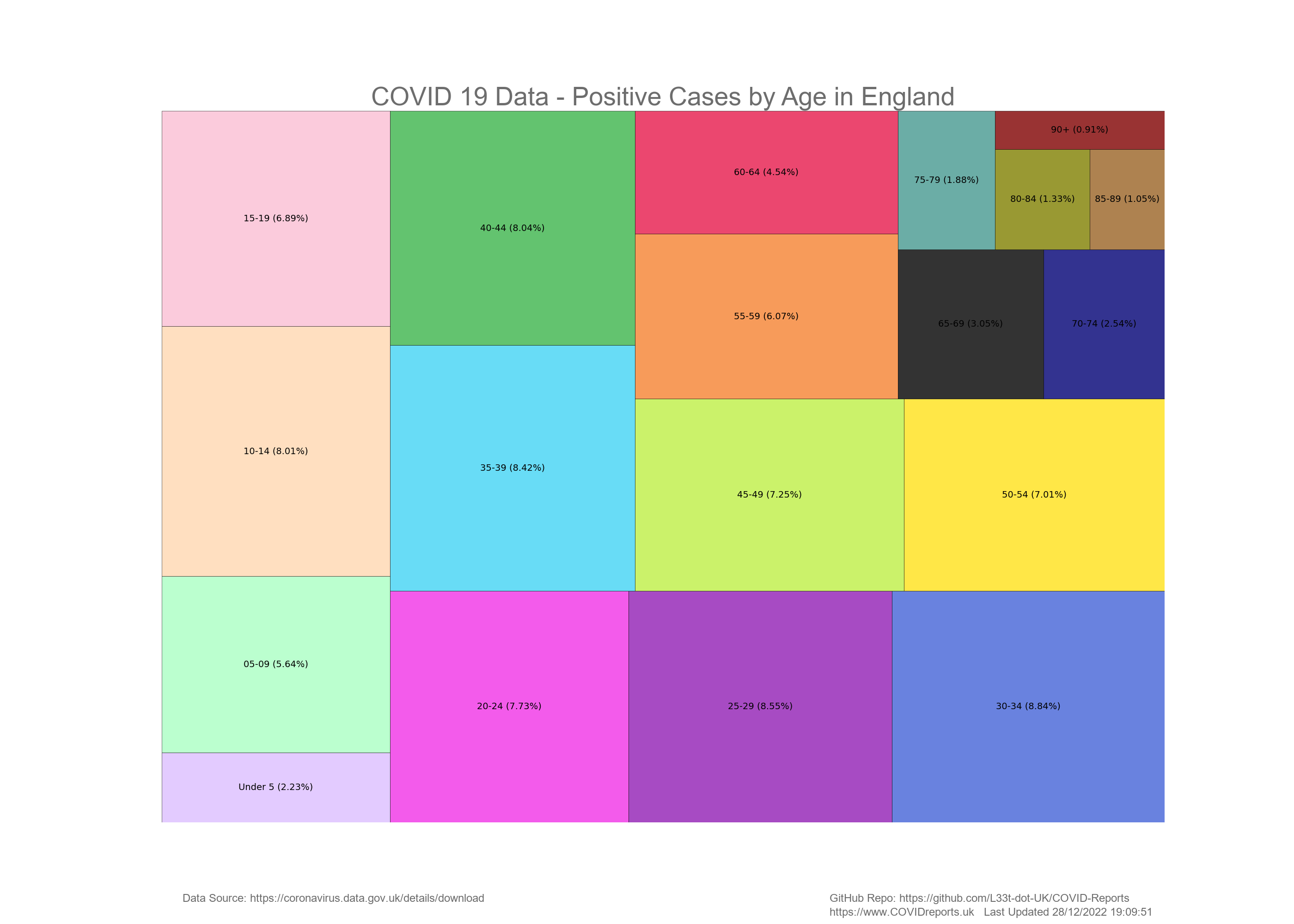
The below diagram is a Treemap of cases in England split up into the different age ranges. Percentages are used rather than actual numbers to make the diagram easier to read.
Deaths
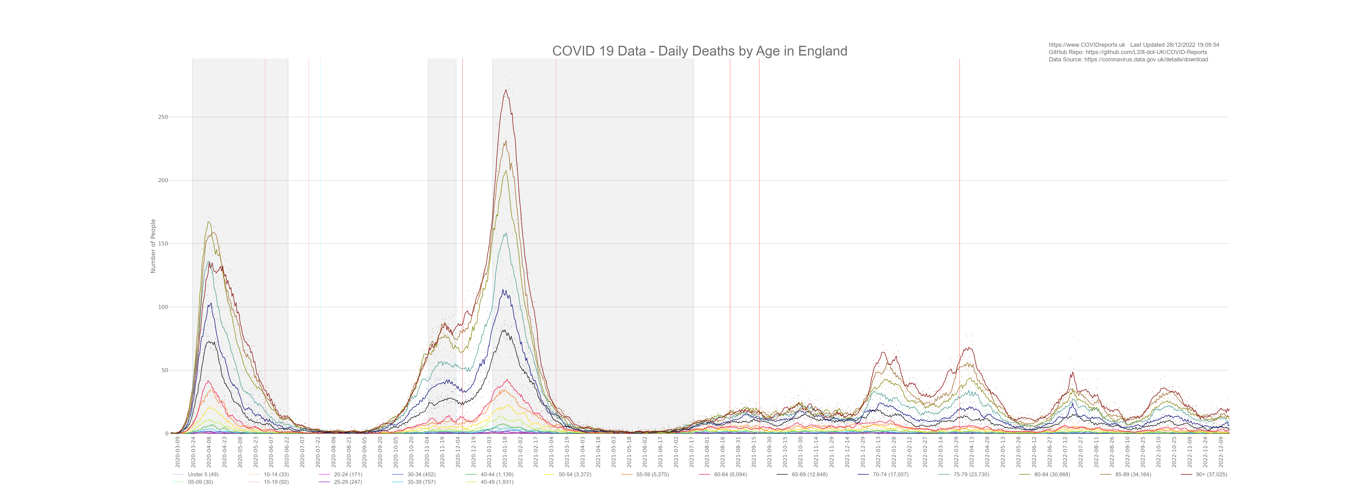
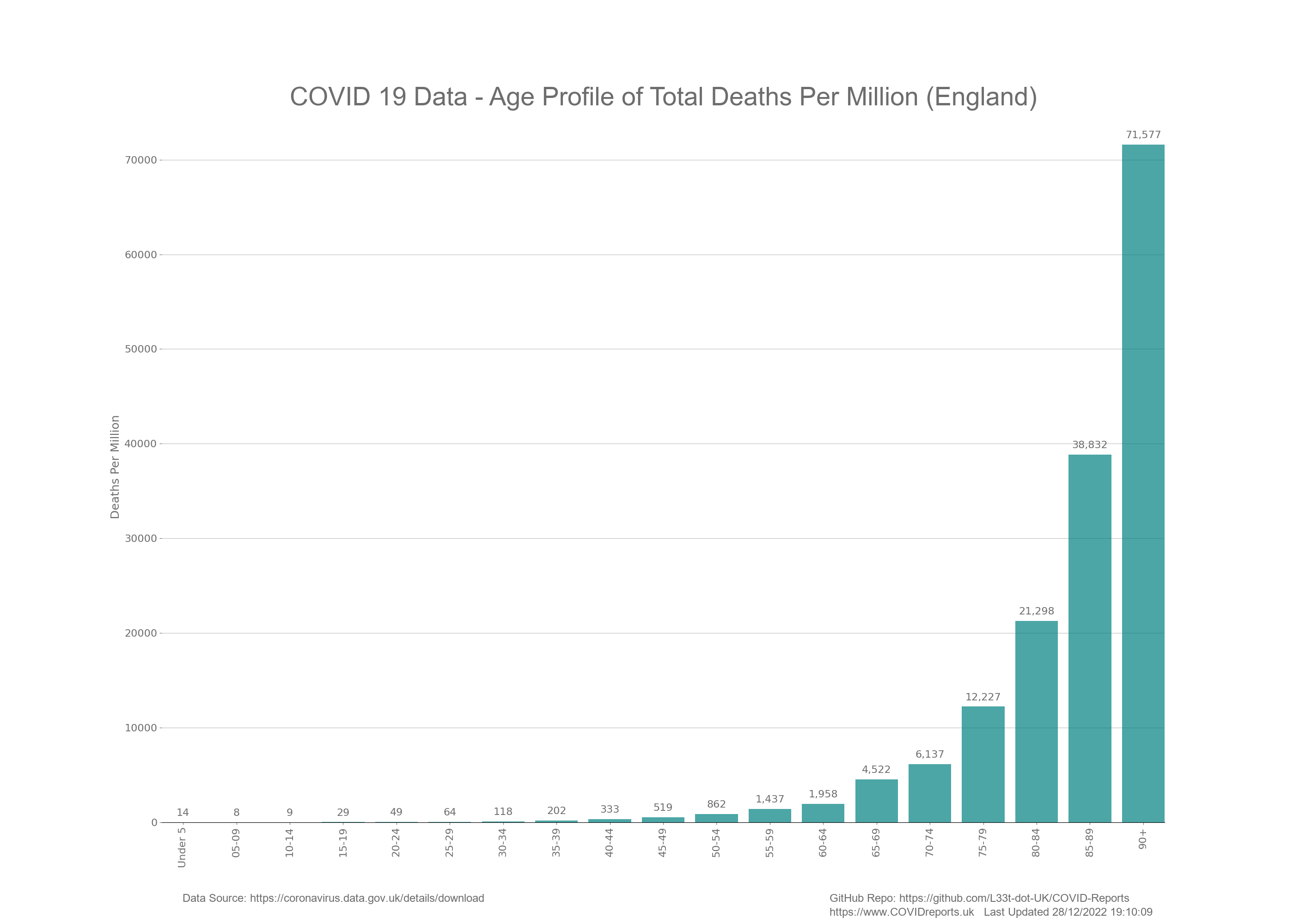
COVID-19 affects people of different ages in different ways. We all know that age is the biggest predictor for death relating to COVID-19 however, it appears that most people are unaware of how this age dynamic plays out. Below is a graph breaking the population down into 5 year age groups and showing daily deaths for each age group. The legend shows the different age groups and the total number of deaths in each age group is shown in brackets.
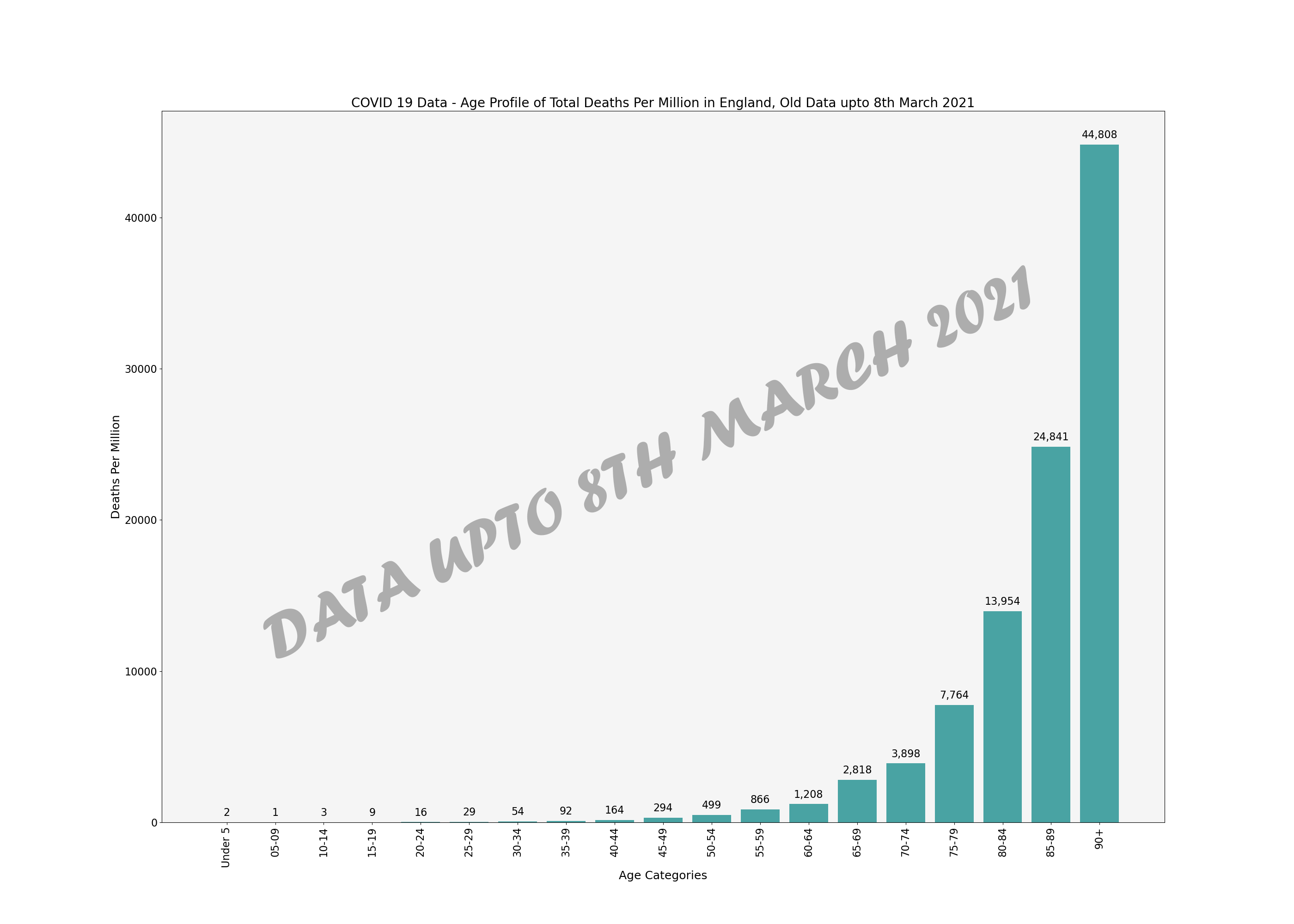
The below bar chart shows total deaths in each age group for the duration of the pandemic.
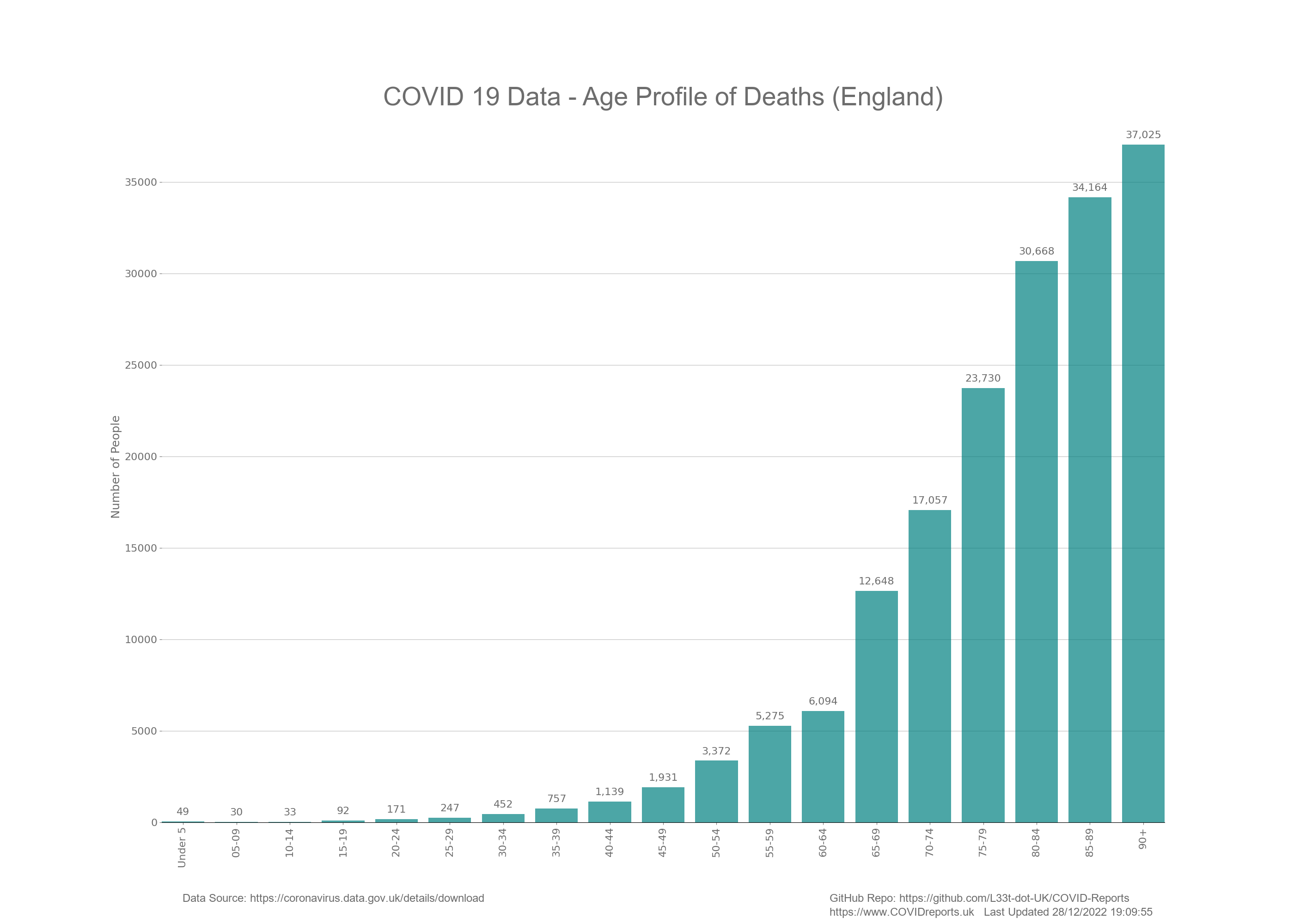
Now you can clearly see from the above graphs that COVID-19 affects the elderly more than the young. In fact for the under 65’s the amount of death is statistically insignificant considering that we have around 1,600 deaths a day in England from all cause mortality. In fact we found that as COVID deaths increased deaths from other causes decreased at a similar rate indicating that there could have been a misattribution of the causation of death for some people.
Let’s have a look at the same data but in a different format. The below Treemap shows the total number of COVID-19 deaths where the area shows the amount of death. For this I have used percentages rather than the actual number of deaths to make it easier to understand.
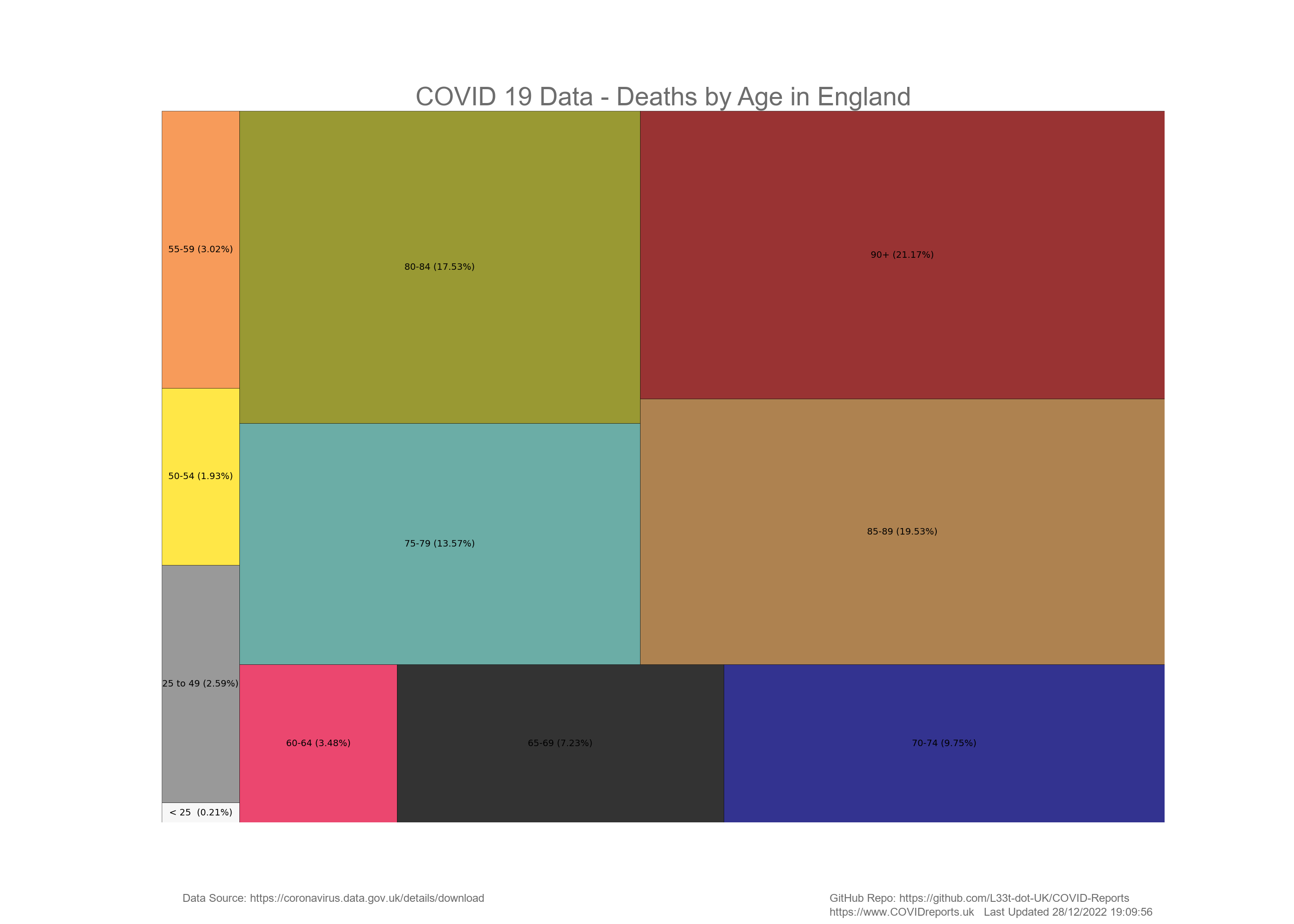
I didn’t label deaths for the under 50’s as they were so small, I put them all together and then separated the under 25’s (school/college/university age) and displayed those figures. The figure in the bottom left hand corner is the percentage of deaths from people under 25. As you can see this is very small and for this we closed down our schools, locked students up in halls of residence and damaged the health of our young people through the wearing of face masks in schools.
You can also see that deaths from people under 50 is also very small regardless of comorbidities. In fact the death for everyone under 50 is so low it does not, nor ever justified a full scale lockdown that we saw in England leading to many more collateral deaths.
Finally to highlight the difference between the ages the below bar chart show deaths in people 60 and older compared to deaths in the under 60’s. Most of the under 60’s deaths below is in the 50 – 59 age range.
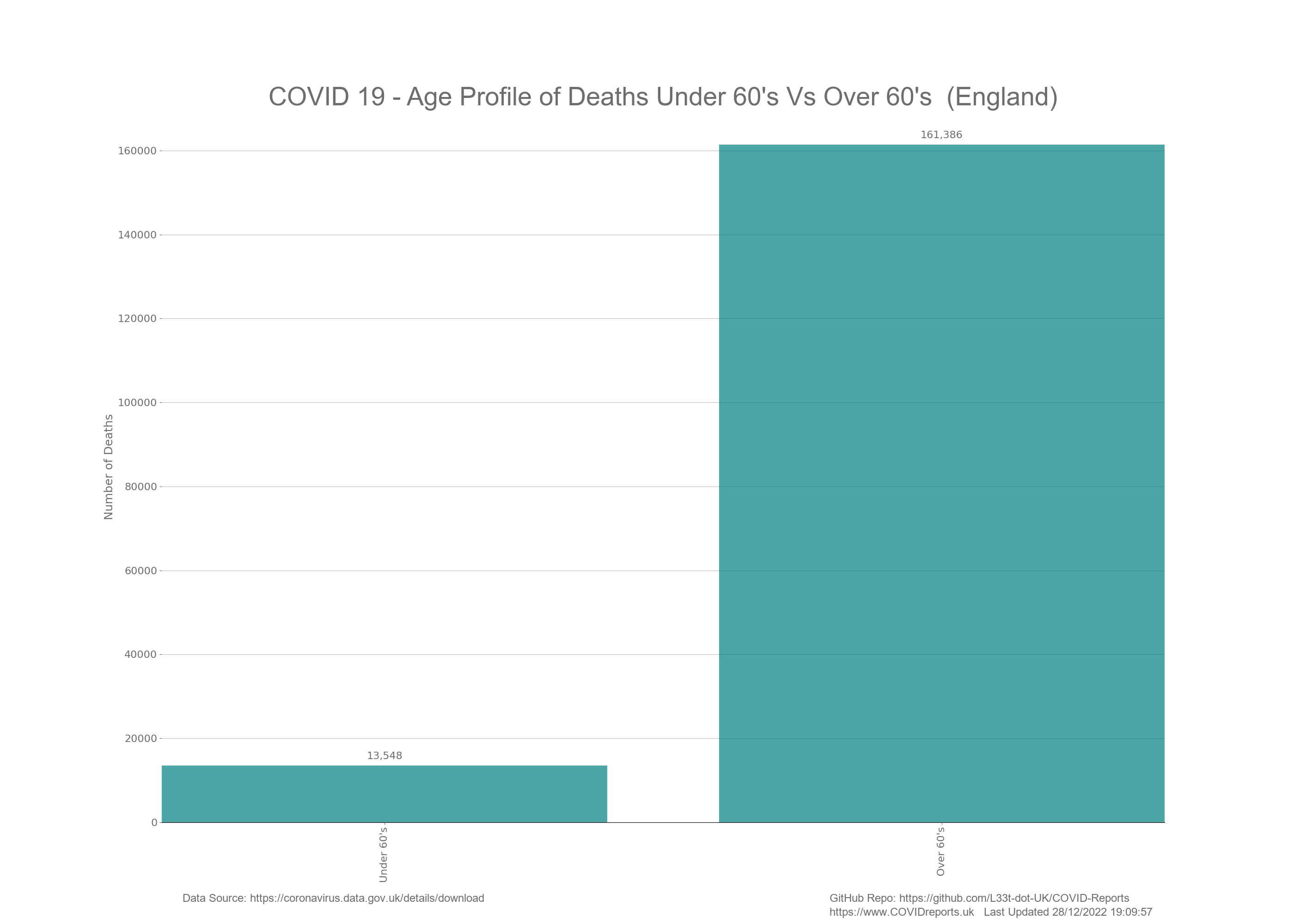
To highlight the age profile of COVID deaths I have included another bar chart underneath looking at deaths for the under and over 50’s. As you can see most of the deaths in the above graph for the under 60’s age group is in the 50 – 59 year olds. The under 50’s have very little deaths with COVID and in-fact when you consider how the deaths are counted you start to understand that these low levels of death is just background noise.

Cases and Deaths per Million People
Please note the below graphs are per million of population and not per million cases in the age groups and is designed as a comparison metric to compare relative risk between age groups.
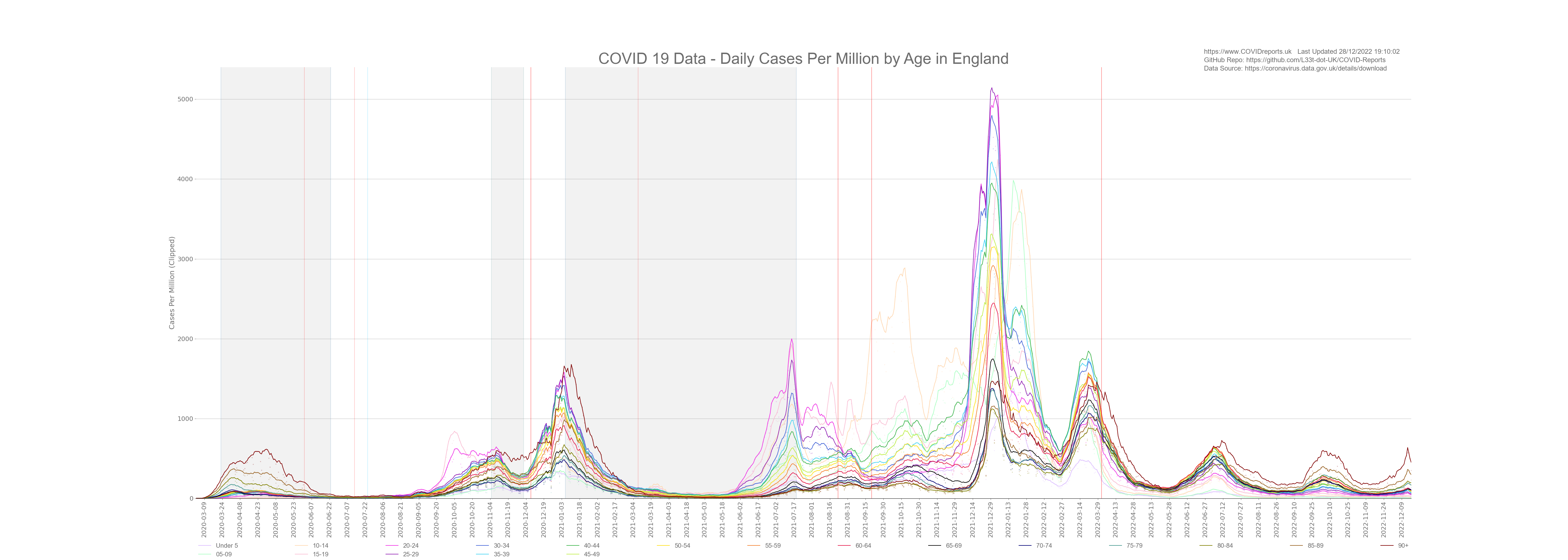
As of June 2021 the UK Government are making the assumption that young unvaccinated people are driving COVID-19 cases. Here we will look at time series graphs showing deaths and cases categorised by age and controlled for population. The below graphs will show daily cases and deaths per one million people.
Before the 8th March 2021 prevalence rates of COVID between the age groups was similar. In fact prevalence rates per one million was the highest in the above 90 year old age group in both the first and second wave. This could have been down to testing regimes in care home settings. What I mean by this is the elderly in care homes were regularly tested whether they liked it or not. These could have been genuine cases or false positives; we will never know due to testing protocols. Some of the elderly were put on end of life care pathways if they returned a positive test. This was done as the nursing home staff believed that it was more humane to give the individual a peaceful death and to keep them out of the hospitals rather than watch them die with COVID complications. The problem with this is that some elderly residents showed no symptoms and could have had a false positive due to poor lab checks or due to contamination in the homes. We must remember that the same staff would have tested multiple residents potentially contaminating swabs; PCR is extremely sensitive. For every resident that this happened to where a diagnosis was made purely by PCR with no clinical assessment an investigation should be held and if this was the case the people responsible should be charged with murder. Human decency should not be abandoned due to fear.
After the 8th of March 2021 testing data lost all of its meaning as we started to treat young people differently than older people. We started to screen young people in schools, colleges and universities giving the illusion that these people were driving infection. The only reason why we started to find more cases in these young people was because we were testing them more often through screening and through PCR testing after contact tracing. The below bar chart shows prevalence rates per one million people before 8th March 2021. As you can see prevalence rates are similar in all age groups apart from under 15’s and 65 -79 year olds.
The 65 – 85 age group appeared to have had some protection up to 8th March 2021 as their case rate per million is low. Unfortunately this did not translate into less deaths for these age groups. They had higher deaths per million than the younger age groups even with fewer cases reiterating the age characteristic of this disease. The older you are the more at risk you are. One explanation for less cases in this age group is that most people would be retired and not working, putting them under no pressure to undertake asymptomatic testing. The people in these age groups would only get tested if they had symptoms, perhaps these age groups are an accurate representation of the prevalence of this disease once over testing and false positives are controlled for.
The below graph shows cases per one million since the start of COVID to present day. Notice how the younger age groups have much higher rates than the elderly. The prevalence rates shown on this graph is a result of over testing. For more information on testing visit the testing page under interventions.
The below bar chart shows deaths per million by age up to the 8th March and the bar chart below that shows deaths per million up to present day. Although the numbers are different the shape of the graphs are the same and increased cases in the young did not change deaths indicating that most of the cases post 8th March 2021 had little to no consequences and could be an indication that we are in a casedemic created through a myopic obsession with testing.
In fact these graphs illustrate that young people are at no risk from COVID as the prevalence rates have more than doubled for young people however the deaths have stayed at baseline levels that are insignificant from a statistical point of view. I would say that these deaths are so low that they are not worth counting as these are more likely to be deaths due to other causes and put down as COVID, i.e. a cancer patient could die of cancer but before death catch COVID in the hospital. This patient would then be classed as a COVID death.
The death per million analysis informs us that the case profile of COVID changed after the 8th March 2021 however the death profile did not. This reiterates the age stratification characteristic of this disease and could point to casedemic conditions that we currently find ourselves in. The question is why does the Government want cases to appear higher than they are through over testing? Who is benefitting from this?
Source for age demographics;
ONS Population Estimates for 2019 (Latest Data)
What we Know so Far
Looking at the above graphs its clear to see that the majority of cases have been exhibited in the younger age ranges whether through false positives or genuine infection. This is not new information and we knew this at the very start of COVID; a disease like this will spread amongst the most mobile first.
We can see a disproportionate amount of death in the older age categories making a mockery of current and past COVID-19 policies. Why did the government decide to lockup the entire population for a disease that kill’s just the elderly who make up a minority of our population. You can clearly see in the data that anyone under the age of 50 is not at risk from this disease, the death rate for the under 50’s is below all cause mortality and in line with everyday risks such as climbing a ladder or driving to work.
Looking at the results from non-pharmaceutical interventions it appears that they actually did more harm than good allowing COVID to get into the Care Homes through early release of patients from hospital putting the people at risk who we should have been protecting the most. For more information regarding this read Amnesty International’s Care Home Report.
In fact I can go further and say with confidence that asymptomatic testing of young people drove a casedemic where younger people were getting positive COVID tests and the elderly were dying.
This can been seen at the end of September 2020 where surge testing took place in schools and universities. We saw a huge increase in cases in the 10 – 24 year old age ranges however very little corresponding death. You can also see this at various points after the 8th March 2021 when we started screening young people and PCR testing them after contact.
If you track surge testing in these data it appears that when ever they decide to surge test a certain age group or location we start to find lots of cases in that age group or location giving the government data that can backup what ever narrative they want to push. This is carried out in low compliance areas and we must understand the motivation behind it. Is it due to genuine surges in infection rates or is it due to political reasons? Why do we find cases where ever we look, is this because COVID was endemic much earlier than we thought, is it due to poor QA procedures in the labs or is it due to genuine surges in infections?
Total death in the under 25’s accounts for 0.2% of all COVID deaths in England this shows that these people are not at risk from COVID and this does not justify vaccinating this age group in fact vaccinating this age group will do more harm than good as COVID is such a small risk and according to the vaccine manufactures the vaccinations do not stop transmission, prevent infection or provide immunity. Lets remember that the vaccines are not approved, they have been introduced under emergency legislation and if this legislation didn’t exist they would not pass the safety criteria to be approved.
These vaccines have weak safety data compiled under weak phase 2 trials. The phase 3 trials are still taking place and won’t be completed until 2022/2023/2024 depending on which vaccine we’re talking about. They were allowed to skip phase 1 trials because of time constraints and the urgency of the pandemic. If your under 50 why risk taking a vaccine that has no long term safety data and appears to have very high incidents of adverse reactions for a disease that you are not at risk from?
The UKColumn takes the adverse reaction data and publishes it on their website. This data is extracted from PDF’s that the UK government releases from yellow card data that can be found here. If we had an informed population and real journalists people of this country would demand that the MHRA investigated every vaccine related death and ADR. As of January 2022 the MHRA have admitted through FOI that they have not investigated a single one even though they struggled to spend their budget for 2021/2022 with around a £15,000,000 underspend. They awarded a contract in November 2020 for an AI driven tool investigating COVID Vaccine ADRs, this contract was worth £1,500,000 and was awarded to an investment bank. The MHRA has not released a single report created by this so called system. Is this corruption or incompetence? I will let you decide.
![]()
![]()
![]()
![]()
![]()
![]()
![]()