Last Update: 15th July, Next update 11th August 2022
Data used to produce these graphs is not from the Government Dashboard, instead I had to download these data from the NHS Statistical Service. The raw data is from monthly returns meaning that this page will be updated during the first or second week of every month. The data can be found using the following link;
https://www.england.nhs.uk/statistics/statistical-work-areas/covid-19-hospital-activity/
We can use this data to build a historical picture of what has happened in the hospitals during COVID and try to understand some of the governmental policies around “PROTECTING THE NHS”. Age groups in this dataset differs from the Government dashboard. The age groups and amount of people in each group is shown below;
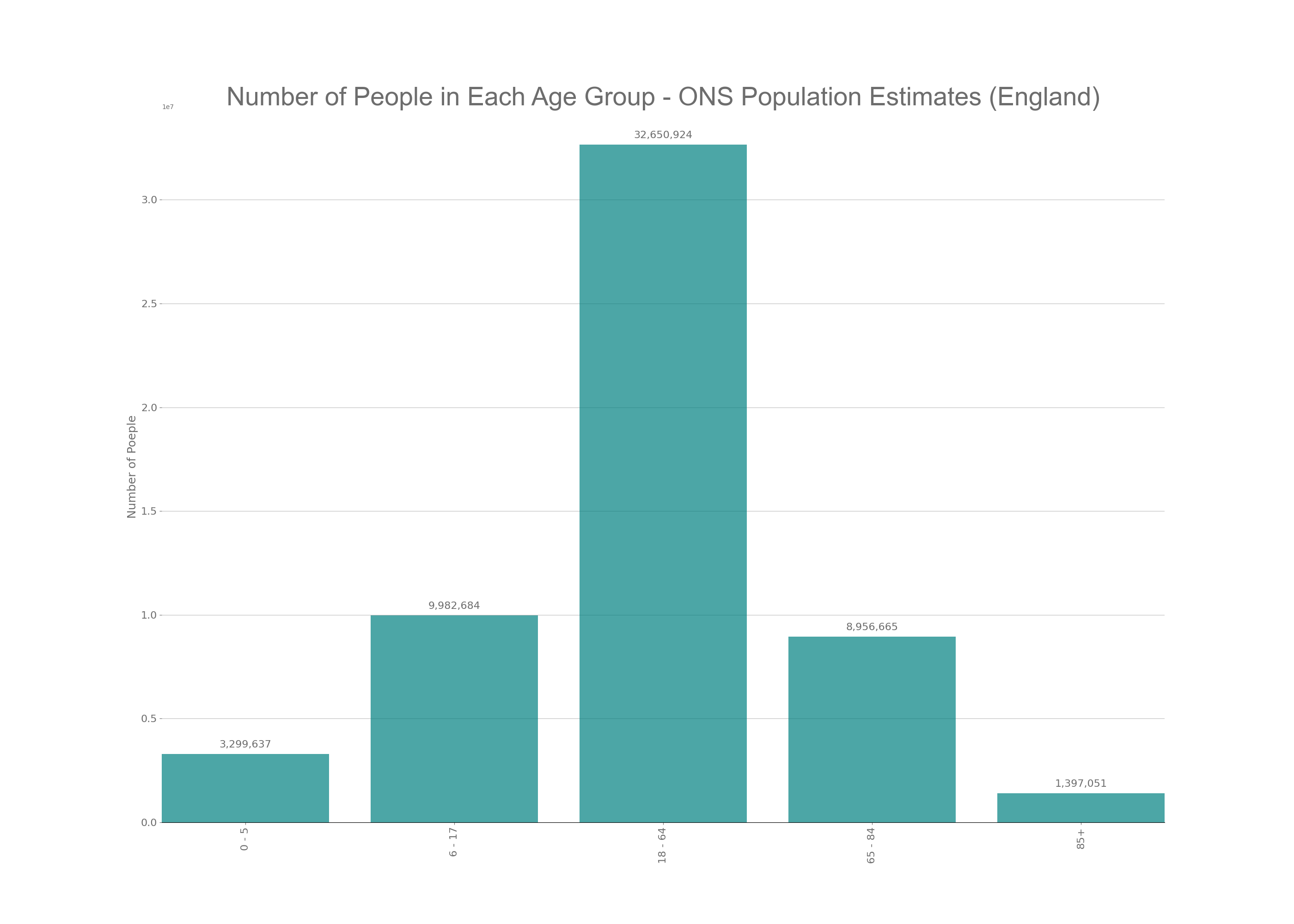
As you can see form the above graph not all age groups are equally distributed. The largest age group is the 18 – 64 year olds and includes low risk, under 50’s and moderate risk 50 to 64 year olds. This is important when we look at the data later on.
The Government Dashboard releases data surrounding new hospital cases, these cases are split into two groups when we look at hospital data from the NHS; diagnoses and admissions. This allows us to see the amount of people diagnosed in hospital with COVID (diagnoses) and people going in to hospital already knowing that they have COVID (admissions). These two figures are then added together for the Hospital Case data that we see on the news and on the Government Dashboard. The below time series graph shows all diagnoses and admissions for hospitals in England since the start of the pandemic.
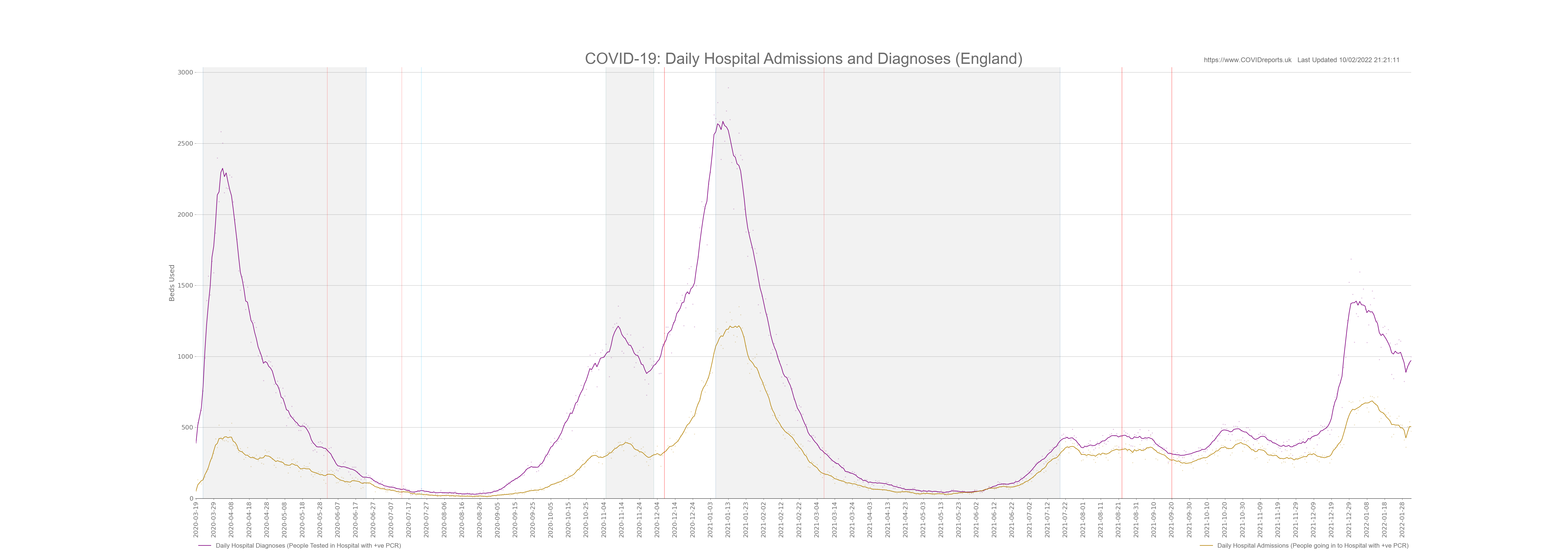
The purple line are diagnoses and the golden line are admissions. You can clearly see that admissions trail diagnoses, I didn’t expect to see this. I expected to see diagnoses trail admissions indicating that when we have more people admitted with COVID we see more hospital acquired infections due to difficulties in controlling the virus.
Hospital Acquired Infections; Admissions v Diagnoses
Hospital acquired infection (diagnoses) appears to increase before admissions increased. To understand this we need to understand what diagnoses are. A diagnoses is someone who is already in hospital and has a positive PCR test (hospital acquired infection) or someone who has gone into hospital and has a positive PCR test, this could be someone who goes in for a procedure and as part of the onboarding process has a PCR test.
An admission is someone who already has a positive PCR test and then goes into hospital. From this we can assume that the vast majority of people who are classed as admissions are going in to hospital because of COVID and for treatment of COVID. We can also assume that the vast majority of diagnoses are people who are already in hospital and suffer a hospital acquired infection. However some of the diagnoses will be people going in to hospital for a procedure and already have COVID and a minority of these people would be people going in to hospital for investigations that end up being complications of COVID and they later get treated for COVID in hospital.
With all of that in mind we can not solely rely on Admissions and Diagnoses to look at hospital acquired infection. I find it shocking that diagnoses are a lot higher than admissions and the difference between these are at its greatest during COVID waves when hospitals limit other services due to COVID related demand. This indicates that diagnoses are mostly hospital acquired infections during busy periods.
To explain why diagnoses lead admissions I will now look at COVID-19 related staff absences. The below graph shows NHS COVID-19 related staff absences, Number of people in Hospital with COVID and COVID Cases in England.
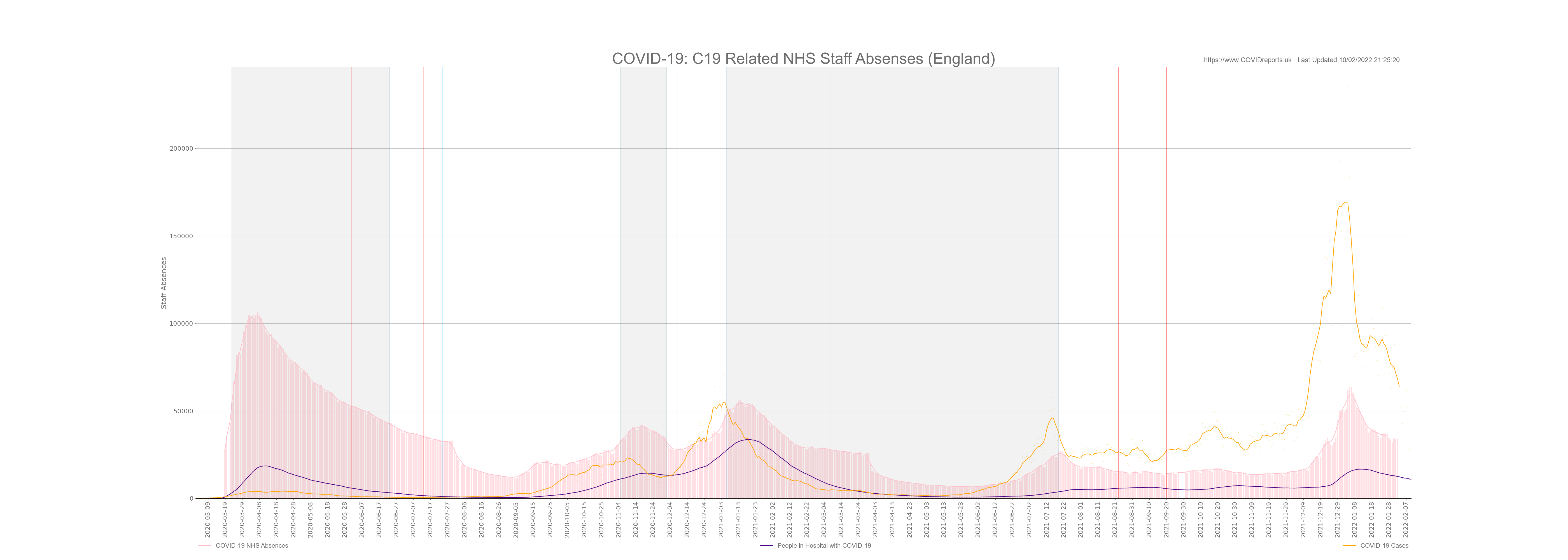
This graph is astonishing, I added COVID cases just to show that the NHS has had more staff absences than the total amount of COVID cases in the entire population of England. We must ask questions as to why this was allowed to happen. Was it due to the lack of PPE or due to silly track and trace policies, how many of these absences had COVID symptoms? and what was the operational impact on the NHS?
Looking at the above graph we see that the number of people in hospital trails the number of staff absences. This could indicate that as the NHS had more absences they found it harder to control the spread of COVID. The staff would have been under more pressure and relied on agency/bank staff. It appears that hospital acquired infections could have been exacerbated through staff absences inflating the Hospital Case data that our Government used to scare the population. With this in mind this data should never have been communicated to the public. The data should have been used for NHS management and data communicated to the public should have been data showing people going into hospital for COVID-19 treatment, not general cases including hospital acquired infection as this distorts peoples perceptions. When this data was used it should have been caveated so lay people could understand it in a more intelligent way.
This is another example of our Government using data to exaggerate the dangers of COVID. Most people believe that the hospital admission and case data shows the amount of people going in to hospital for treatment of COVID and that hospital cases are people being treated primarily for COVID. THIS IS NOT TRUE.
Hospital Admissions and Diagnoses by Age
MSM are constantly increasing fear and anxiety over COVID. One method that they use is to go into hospitals and interview some young people on oxygen to let all the young people know that they could end up in hospital due to COVID complications increasing compliance and vaccine uptake in these age groups. We will now debunk these reports by looking at the data.
The below graph shows admission and diagnoses (added together, this is the same as Patients Admitted to Hospital on the Goverment Dashboard) for different age groups.
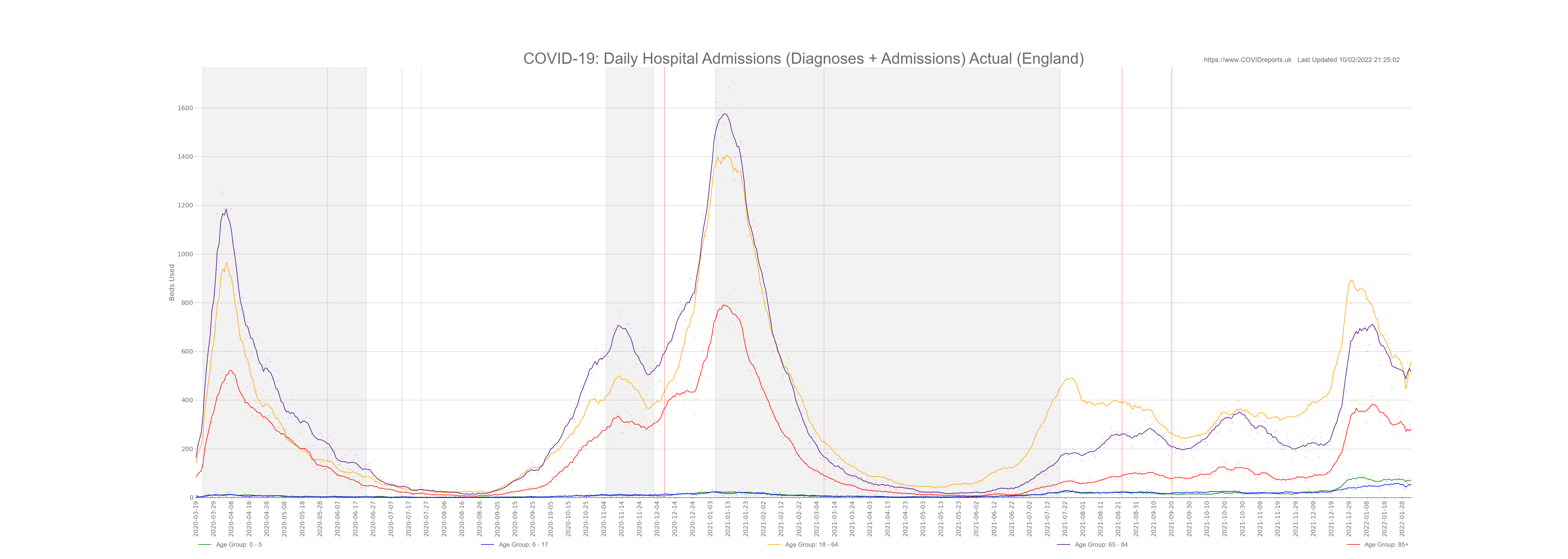
Now this is an interesting graph, it shows that hospital admission for the 18 – 64 year old age group is in fact quite high and is just below admissions for 65 – 84 year olds. However we must remember the different amount of people in each population group and bare in mind that the 18 – 64 year old age group includes people who are at an elevated risk due to age; the 50 – 64 year olds.
Below is the same graph with age groups adjusted for population.

Once we control for population you see that the age groups who are at more risk from hospitalisation is the same as risk from COVID related death. The older you are the greater the risk.
So the question is, did the MSM mislead people when they said that hospitals were filling up with younger people? This is a matter of opinion, I believe that the media mislead people because once we control for population we find that the most at risk from hospitalisation are the elderly, this data has not changed. However in 2021 we saw the 18 – 64 year old age group dominating hospital numbers (not controlled for population) the MSM will link this to vaccines, I would say that these are the people going into hospital for delayed procedures (diagnoses) and the vast majority of admissions could have been older people within that age group or younger people celebrating the Euros and getting into trouble, ending up in A&E with a positive PCR. When controlled for population we find that even in 2021 18 – 64 year olds hospital numbers were still below the older age groups. I can’t call the MSM out for FAKE NEWS but what I can say is that the MSM purposely mislead younger people into thinking that the threat of hospitalisation was higher than it actually was. If your under 50 the risk of hospitalisation is still low and if you do end up in hospital oxygen therapy will be used for a few days and you will be released. It is very rare for under 50’s to end up in ICU and subsequently die with COVID.
Bed Capacity
Now this is the crux of the matter. The Government told us that we need to protect the NHS but we all saw empty hospitals. Now to make sense of this we need to look at bed capacity. The below graphs shows general beds used in the NHS and COVID-19 occupied beds for wards and mechanical ventilation (this is the same as critical care beds) from April 2020 onwards.
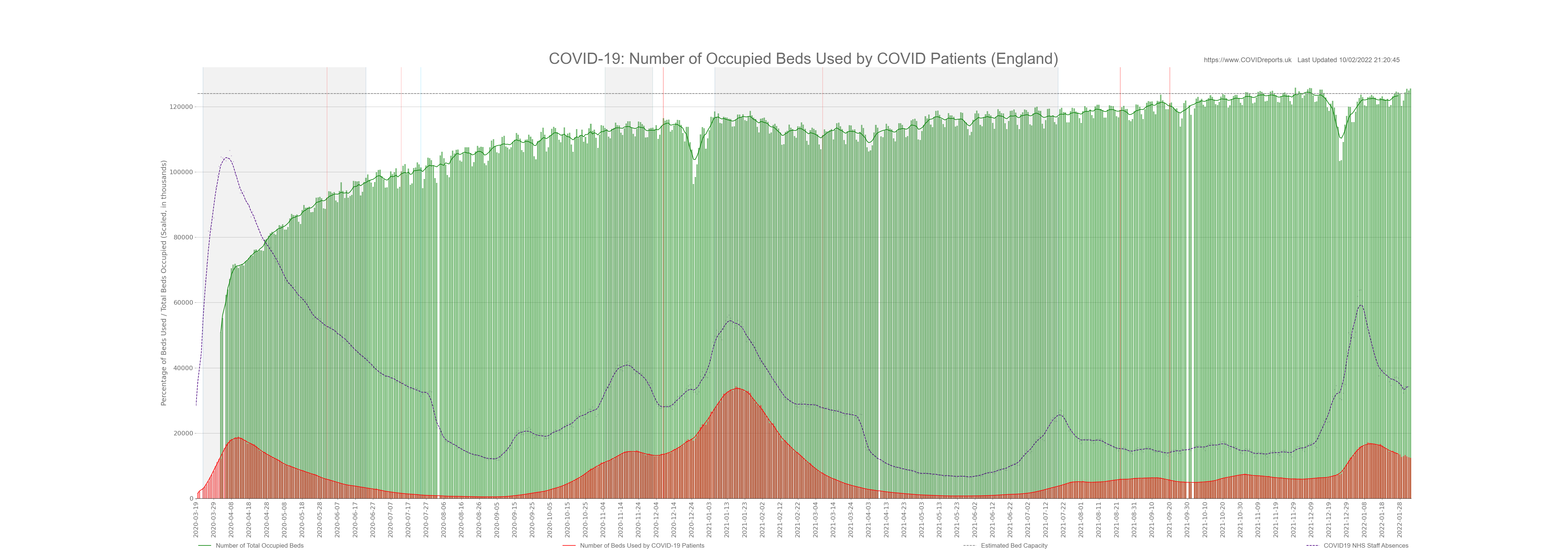
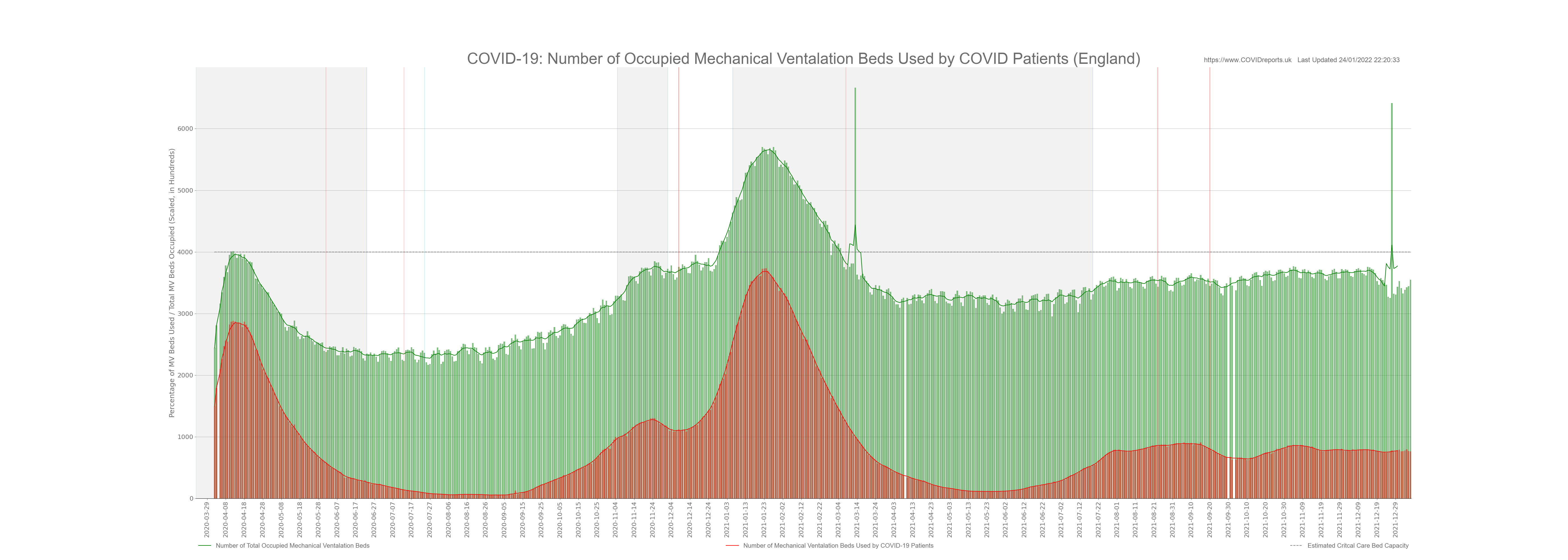
Please note that the dotted line is estimated capacity, in reality this line will go up and down as demand and operational factors playout. I couldn’t get high quality data showing daily bed capacity so I used 4,000 for mechanical ventilation and 124,000 for general beds. This is in line with what the NHS publishes.
The two graphs above are very interesting; we will look at general occupied beds first (first graph). These graphs start in April 2020 and as you can see the NHS did a really good job of clearing space in hospitals at the start of the pandemic. In fact at the start of April hospitals were only 60% full. This was because they cancelled most procedures and discharged 25,000 elderly patients back into the care system. If your interested in this read Amnesties Internationals Care Home Report (October 2020) and then ask yourself why no MSM reporters reported on this report. Unfortunately clearing patients from the hospitals resulted in many collateral deaths and would have contributed to the COVID and non-COVID excess death figure form 2020.
Looking at the first graph you can see that hospital wards were never full with COVID patients, in fact during the second wave people in hospital with COVID peaked at just under 40,000. We must remember that most of these people were in hospital anyway and either caught COVID in hospital, just happened to have a positive PCR with no symptoms or went in for a procedure. We know this after looking at the diagnoses vs admissions graph above.
I plotted COVID-19 staff absences on the Occupied Beds graph to see if patient numbers were affected by staff absences and they were not. I also did this as a reminder of the huge amount of staff absences due to COVID-19 policy. You can see that towards the end of October 2021 bed capacity is nearly at its maximum and this isn’t because of COVID as COVID beds make up less than 5% of occupied beds at this time. When the Government uses Omicron as an excuse for our failing NHS we must call them out. The reason why the NHS is failing is due to Governmental incompetence. You can clearly see from the graph that maximum bed capacity was reached by October 2021 before the flu season started. Most of these beds will be occupied by patients who did not get treatment during 2020 and 2021 when they needed it. Yet another indicator of lockdown policy failing the people it was supposed to protect.
The second graph tells a different story. Mechanical ventilation beds were dominated by COVID-19 patients, Although the hospitals were never full of COVID patients critical care beds were. The situation was so bad that the NHS managed to increase capacity by 20% at times to cope with demand. This led to substandard treatment and could have resulted in more deaths.
When the Government said “PROTECT THE NHS” what they really meant was close down the NHS so the public don’t realise that we have cut critical care beds down to 7 per 100,000 people, less than most European countries. They shut down the NHS to hide their mismanagement and destruction of our health service that started in the Blair era and continued under the Conservatives. If we had capacity similar to Germany at 33 per 100,000 COVID would never have been a problem for the NHS and deaths would have been much lower. In 2020 Germany didn’t have any excess death and their health service stayed open.
We should use the COVID experience to move away from the LEAN operating model and invest in more critical care beds moving towards a European model. The NHS fails every year during flu seasons regardless of COVID.
Conclusion
The NHS was never overwhelmed with COVID patients and the clearing of hospitals was not necessary. ICU beds were overwhelmed and staff working in these wards were overworked and put into a situation that they should never have been put into. Many of these people will suffer from PTSD in the years to come and this could have been avoided through the correct provisioning of critical care beds. NHS management and Government are to blame for this. All doctors and nurses should all be commended for their work during the pandemic, they showed professionalism and rigor throughout.
Hospital admission data was misused to scare the public by overinflating the figures and giving the impression that all hospital cases were people who had been admitted for COVID and were receiving treatment explicitly for COVID. As I explained above this was not the case.
As a result of COVID measures we now have an NHS that is over run with sick people, as we move through the winter the NHS will turn patients away as they will not have the capacity to treat everyone. They are already using ambulances as waiting rooms in A&E departments. GPs are not seeing patients forcing these patients to go to A&E departments in order to get seen. The booster role out implemented due to Omicron will make this situation even worse where GP’s are now prioritising vaccines over seeing genuinely sick patients due to Governmental targets. This is MADNESS why booster people under the age of 50 when they are at very little risk from COVID prioritising them over sick patients that need medical assistance.
Staff absences appeared to be excessively high throughout the pandemic. Questions must be asked as to why staff were isolating? was it due to contact or symptoms and could this have been managed better. Hospital Acquired infection appears to have been prevalent throughout the pandemic contributing to 30% to 60% of all hospital cases. This is not necessarily an issue but should be communicated to the public when hospital data is used to allow people to put the numbers in context.
The Government will use Omicron to scare the population and hide their mismanagement of the NHS we must call them out when this happens. The NHS will collapse this winter and it will not be because of Omicron.
Update: As of the 8th January 2022 14 NHS trusts have implemented Emergency Measures due to high demand (non-COVID) and staff absences, Government ministers are being paraded on TV using this as a reason for more and more people to get boosted even though these measures are not due to an influx of COVID patients. Another sign of our so called Government loosing the plot. These people are really very dim indeed!
![]()
![]()
![]()
![]()
![]()
![]()
![]()