Lets start by looking at an overview of COVID where we can look at cases, hospital admissions, people in hospital and deaths. All time series graphs on this website will have certain events on the x-axis, these events are shown in the legend of the below graph and mark lockdowns, introduction of face masks, start of vaccination, etc. For these events I use the same colour lines to keep the graphs consistent. These Lines are denoted as (VLINE) in the legend.

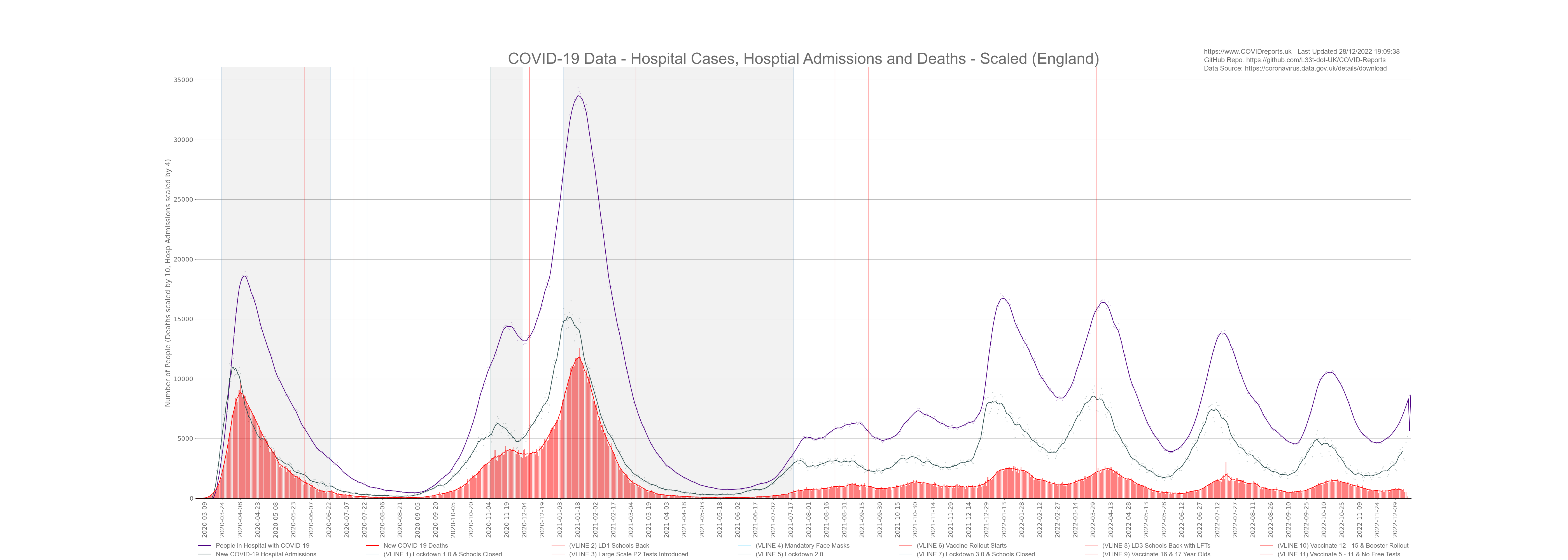
The above graphs shows as we have increasing cases we will also have increasing hospital admission, followed by increasing people in hospital followed by increasing deaths with the lag between cases and death being between 10 to 21 days. The same happens when cases start to decrease followed by decreasing hospital admissions, etc. This is what we expect to see and at first glance it appears that increasing cases are driving increasing hospitalisations and death. However when looking at the age profile of cases and deaths we see that the vast majority of deaths are in the elderly and the vast majority of cases are in the young. Looking at aggregated case data and not splitting it into age groups we tend to mask what’s going on in the vulnerable portion of the population. For more information regarding this visit the Cases and Deaths page where I unpack the data and look at what’s going on in different age groups.
The above graph also shows the low amount of death from people with COVID, we must remember that in the UK a COVID death is someone who has had a positive PCR test within 28 days of death or displayed COVID symptoms around the time of death. COVID-19 deaths are not deaths from COVID but deaths with COVID through a positive test and not necessarily through a clinical diagnoses. For more on this visit the Testing part of this website.
What is a Hospital Admission/Case?
It’s important to note that a hospital admission/case is someone who was admitted to hospital with COVID, it’s also important to note that a Hospital admission/case is someone who catches COVID in hospital at any time during their stay. At least 20% (Sage estimates as much as 40% during the first wave) of COVID cases were caught in hospitals and hospitals we used end of life COVID wards where patients were put at the end of their lives even if they did not have COVID. These patients would inevitably catch COVID before death and go down as a COVID death statistic. The Government bundles all of these cases together and classifies them as hospital cases, fortunately for us the NHS splits this data into two datasets; Admissions and Diagnoses. For more on hospitalisations visit the Hospital Data part of this website to see just how many people caught COVID in our poorly ran hospitals.
Looking at overview data it appears that lockdowns decreased case numbers, hospitalisations and deaths however if we look at other datasets such as testing, the positivity rate and growth rate we see that the increase in cases were already slowing before lockdowns suggesting that lockdowns did not cause the decrease in cases. For more information on this visit the Lockdown and Testing pages under interventions.
I will end this overview with a graph that I call Deaths vs Deaths and the point of this graph is to demonstrate how the media made the pandemic seem more severe than it actually was. When we talk about deaths we can use 2 data points one is death by reported date and the other is death by death date. Now the death by death date can lag by as much as 10 days as all deaths will not be reported on the same day or even week of death. Therefore death by reported date is a more up to date figure however, there is an issue with using this figure and that issue is that deaths are reported in limited numbers over the weekend so after the weekend we have an overspill of deaths that need reporting and to make the matter worse we will also have an overspill of deaths from previous days as it can take time to report each death. This means that the reported death numbers are generally higher on a Tuesday, Wednesday and Thursday. These are the days that the news will normally have headlines of high death figures. They rarely report the death figures over the weekend as they will be lower. This is a nuanced point however, it has a big affect on how people view COVID.
The below graph illustrates this where the red bars are deaths by death date and the blue bars are deaths by reported date. If you click on the graph it will open a high resolution version where you can clearly view the bars.
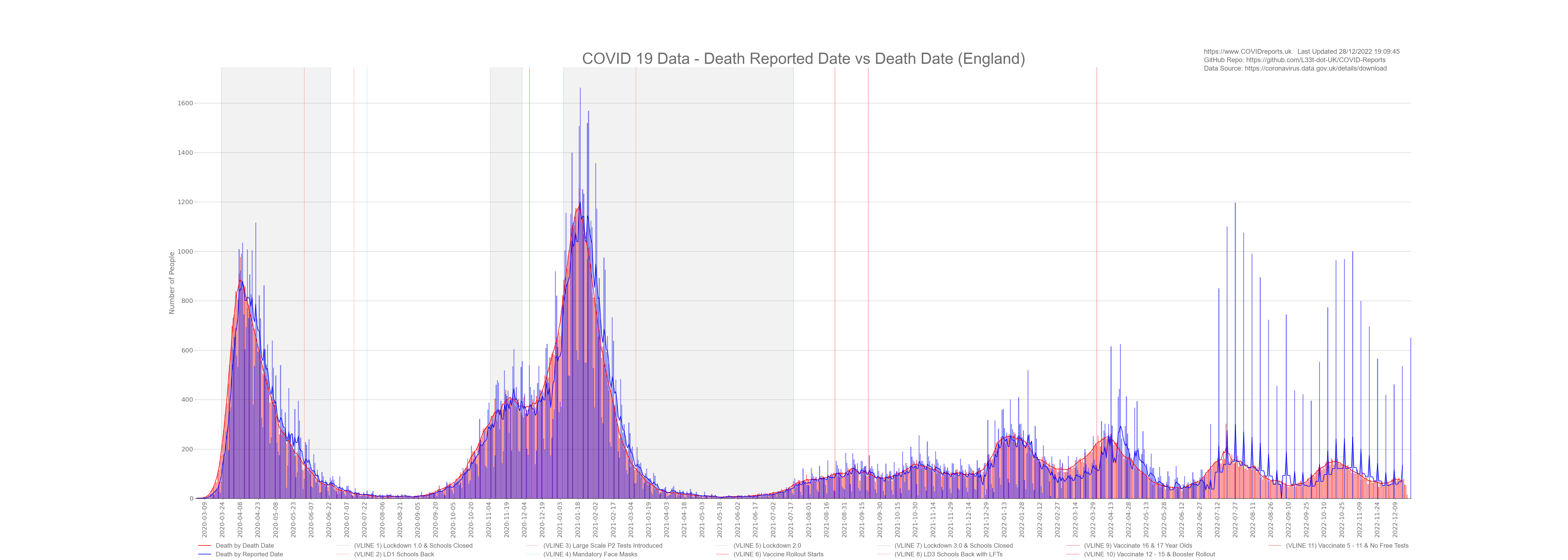
If you were to zoom in on the graph you will notice that during most weeks the blue bars (death by reported date) will be higher than the red bars (death by death date) for 5 days and then lower for 2 days. These 2 days will be the weekend. At the start of COVID this was Saturday and Sunday however a change was made at some point and the lower days ended up being Sunday and Monday.
An example of how this can be misused (and was misused on a weekly basis) is when we had the peak in January 2021. On the 20th January 2021 the media reported new highs of 1662 deaths (England only) that day the actual death number ended up being 1172 which is 29% percent, 490 deaths less.
![]()
![]()
![]()
![]()
![]()
![]()
![]()