We have 3 testing pillars in England, an explanation of each pillar can be found on the Governments website;
Here we will look at the testing strategy to see if it’s a useful measure and to try and understand the data. In short the testing pillars are as follows;
- Pillar 1 – Clinical Need
- Pillar 2 – Testing in the community dictated by Government Policy
- Pillar 3 – Serology testing looking for antibodies
- Pillar 4 – National Surveillance testing supported by PHE for the ONS
A Little About Testing
Tests are not perfect and we will always have false positives and false negatives. A false positive is when someone is healthy but their test is positive and a false negative is when someone has COVID and they get a negative test result.
Early PCR tests had very high false negative rates depending on when the sample was taken after infection. We believe that the false positive rate is low at less than 5%. An early report into these issues can be found here. A Lancet article in to this can be found here. Most articles regarding this agree that false negatives will be higher than false positives when prevalence is high and vice versa when prevalence is low. With this in mind we can confidently assume that the testing figures are an underestimate of COVID-19 cases during high prevalence conditions and an overestimate under low prevalence conditions. In short this means that when we have a low amount of cases with a lot of tests being carried out, most of these cases could be false positives and when we have a lot of cases false negatives could overwhelm false positives meaning that we could miss genuine cases. More on this is explained below. A case is anyone who has had a positive test for COVID-19, it does not necessarily mean that they are ill with COVID-19.
The Government worked with industry to successfully increase testing capacity which is one of the success stories of this pandemic, however this testing capacity came at great cost where we pay 3 to 5 times more per test than our European neighbours. This increase in capacity resulted in some of the quality control mechanisms to have been bypassed in many of the labs. For instance in accordance with WHO guidelines, labs should ensure that 2 distinct pieces of SARS-COV-2 RNA is present in a positive test however we know that many labs have been declaring samples as positive for SAR-COV-2 after finding only one RNA sequence. This invalidates up to 60% of our COVID cases, the report into this can be found here.
It has come to light that most labs are running PCR tests through many amplification cycles, Experts agree that no more than 25 – 35 cycles should be carried out on a PCR test. If a lab exceeds this it is possible that they are amplifying samples of RNA that are so small they would never infect the host. PCR tests can not determine between live viruses and dead virus fragments; running many cycles could be an indication that the detected RNA is actually parts of a dead virus rather than a living infectious one. The average PCR cycle threshold at time of writing in the UK is 42. This means that most of the PCR tests conducted in the UK should be null and void as these could be either false positives or positive for a person who will never develop symptoms and never become infectious.
When carrying out PCR tests cross contamination can be a huge problem, to mitigate against this labs will usually have control tests every so often. It will be up to the lab when to carry out these controls, a normal period would be every 10 tests or so. These controls have been bypassed or relaxed in many UK labs in order to increase capacity. The Government was made aware of this but refused to introduce controlled negative tests at set periods ensuring that our labs were fit for purpose and having a known false positive rate. An example of how sensitive these tests are is that early in the pandemic an American lab had false positive rates as high as 33%. After investigating this they found that a contaminated beaker left 7ft away from a negative pressure chamber was creating these false positives.
Due to issues in the labs and test samples being taken by poorly trained individuals we can reasonably assume that both false positive and negative rates will be much higher than they would be in ideal conditions (under ideal conditions false positives will be no higher than 0.08% according to the ONS when looking at pillar 4 data). This coupled with Bayesian theory informing us that under low prevalence conditions false positive rates could be much higher than expected emphasises the fact that we need to get away from the “test everybody” mindset. Any doctor should be able to explain why we don’t carry out mass screenings for diseases that pose no risk.
Example 1 – Low Prevalence and False Positive Test Results
An example of this could be that during the summer we have hardly any real cases of COVID however we carry on testing large amounts of people similar to what we did during the summer of 2020. For argument sake lets say that the false positive rate is 3% but the prevalence of the virus in the tested group is only 1%.
Lets say we test 300,000 people we will expect to find 300,000 * 0.01 = 3,000 real cases. However we also find some false positives 297,000 * 0.03 = 8,910 cases, we have nearly 3 times more false positives to actual positive cases. Lets say that under these circumstances we had a 20% false negative rate that would give us 3,000 * 0.8 = 2,400 genuine cases and 600 people will get a negative test result when they are in fact positive. This example is made up however it demonstrates the problem with false positives in a low prevalence scenario.
Example 2 – High Prevalence and False Positive Test Results
In this example we will look at false positives in a high prevalence scenario. Lets say that the prevalence of the virus is at around 40% of the test group (similar to what we saw in the first wave) with a false positive rate of 3%.
We test 300,000 people and we would expect to get 300,000 * 0.40 = 120,000 real cases. We would also find 180,000 * 0.03 = 5,400 false positive cases which is a small percentage of real cases that were found. However in this scenario false negatives create a huge problem. As before lets assume that false negatives are at 20% this means that we won’t find 120,000 cases instead we will find 20% less; 120,000 * 0.8 = 96,000. This means that 24,000 people will have been infected with COVID-19 but have a negative PCR test.
In the below video Prof Norman Fenton explains why we have an issue with false positives in low prevalence scenarios that are componded when we use testing to screen a population of asymptomatic people.
As you can see with the above examples, during a pandemic like COVID-19 it is important not only to have large testing capacity; to test people with symptoms and not screen the entire population, but to also have high quality tests and good quality control procedures in the labs. Under current conditions labs in the UK fall short of this and could be contributing to noisy datasets around cases. This coupled with the fact that we are testing asymptomatic people and using these numbers to scare a population where the vast majority are not at risk contributes to a pandemic that appears to be much worse than it actually is.
With all of this in mind we must understand that large amounts of cases will not necessarily lead to a large amount of death or hospitalisations. This can be due to the above reasons and due to large amounts of young people getting positive PCR tests who are not at risk and in general will not end up in the hospital. In fact the Government should release 2 datasets; the number of positive tests with symptoms and the number of positive tests without symptoms for us to understand COVID in a more intelligent way.
Positivity Rate
We will look at three data sets when considering positivity rates. The below graph shows positivity rates for Lateral Flow Tests, PCR tests and overall positivity (both tests). As you can see LFT positivity rates are far lower than PCR positivity rates. This is because PCR tests are more sensitive (more false positives and real cases detected) than LFT’s and PCR tests are used in testing centres, testing more symptomatic people where as LFT’s are being used to screen large amounts of people in the workplace and at school. We can see from the positivity graph that PCR tests are driving the increase in cases being seen post 8th March 2021. This article describes what the positivity rate is and how it can be used to make public health decisions. It sets the threshold at 5% when considering the easing of lockdown.
However, this metric can be manipulated through pillar 2 testing by either decreasing or increasing testing at anytime to either decrease or increase the positivity rate. Therefore this metric should be used under careful consideration where an understanding of testing policy is paramount.
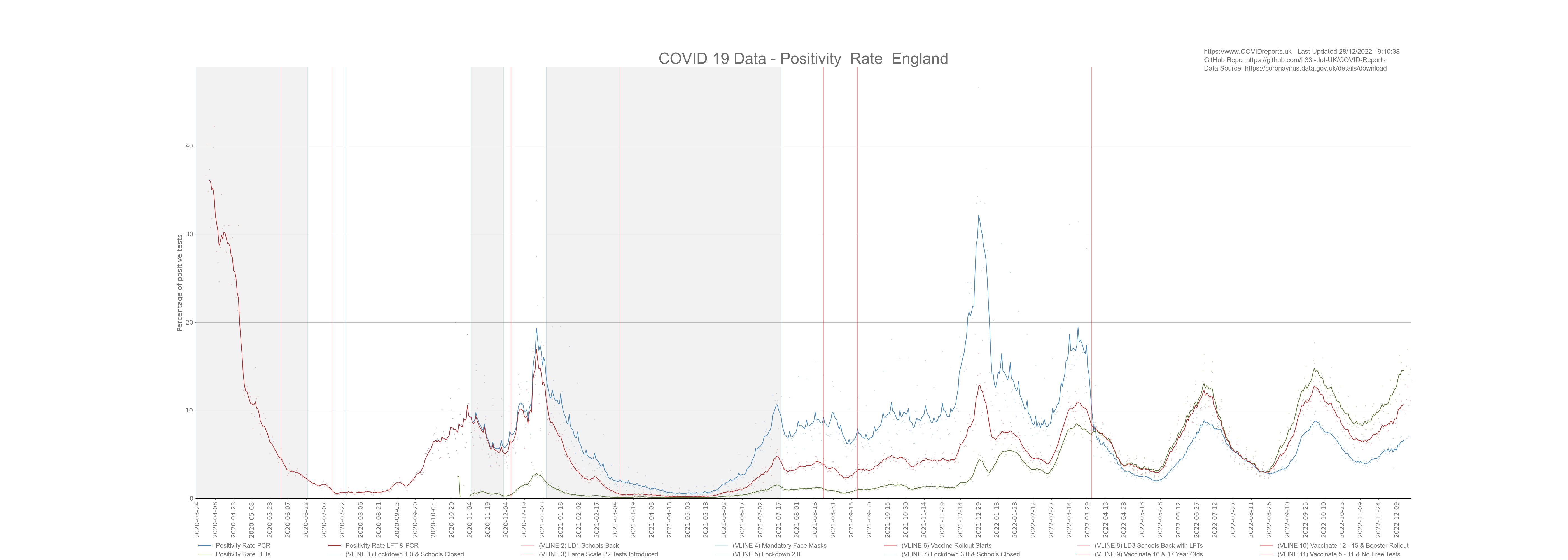
With that said you can clearly see that the positivity rate has been below 5% between February and July 2021 however, the UK government did not ease lockdown until mid July 2021 even with low positivity rates. I believe that this was done because the government wanted to coerce more and more people into getting vaccinated. If you remember they said that lockdown would ease after we vaccinate the 70+ year olds, then it was the 50+, then it was the 30+. A clear nudge tactic used by the people that we pay to coerce us in to taking a medical treatment that most of us will not benefit from.
Screening School Children
We must stop weekly testing of school children. It provides no benefit and is doing real harm to their mental health. The positivity rate of these lateral flow tests is so low it makes them useless and there is no evidence the asymptomatic spread occurs between healthy people. We’re carrying out a medical procedure that is not benefiting the people undergoing it, this makes it unethical. Children are not at risk from COVID so why should they get tested on a weekly basis. Out of the one million plus tests carried out daily we’re finding less than 2,000 cases (as of June 2021) most of which are not in schools and most of which would not result in transmission of COVID as these people are not necessarily sick or contagious with COVID. We know from the data that school children are not a driving factor for this disease as we saw no increase after lockdown 1 when the schools went back with no control measures. We also saw no increase after lockdown 3 with control measures, cases flattened out due to over testing however this flattening was not seen in the death data as deaths continued to decrease. The fact that the flattening was not seen in the death data proves that most of the cases were either false positives or in people who were not at risk from COVID. As of July 2021 we saw an increase in the positivity rate and an increase in cases in young people. This increase is solely due to over testing and is a total waste of money. As mentioned earlier these cases are not driving transmission nor do they end up as deaths.
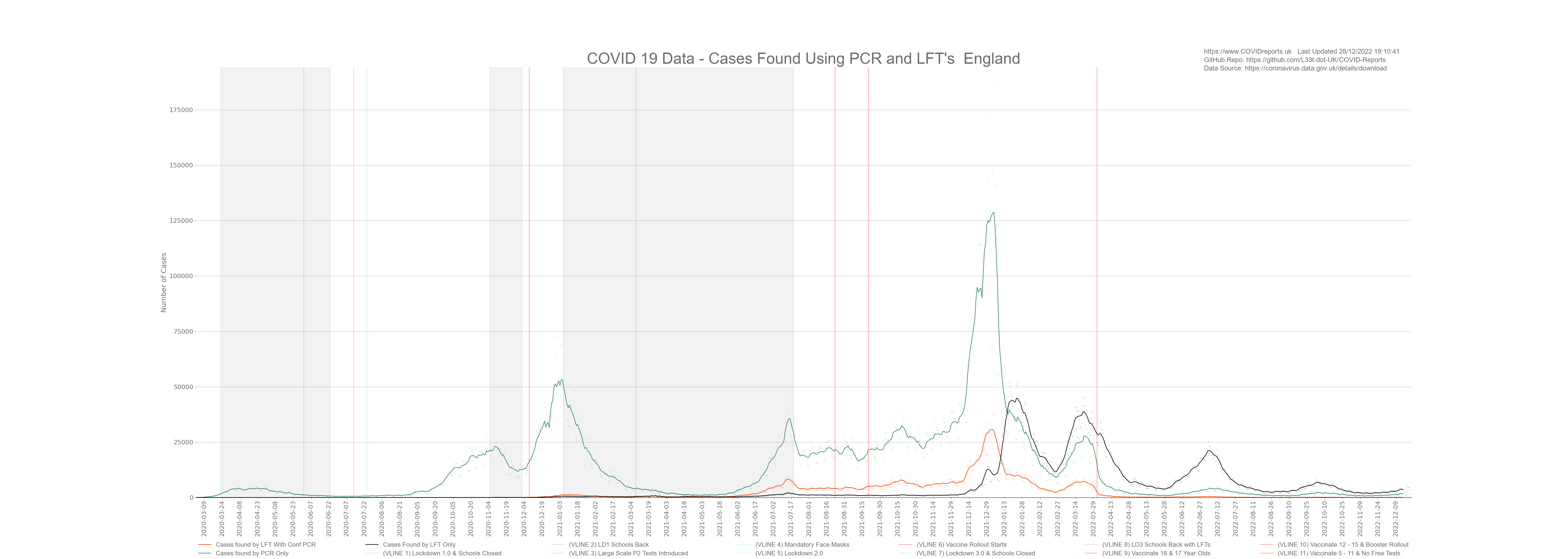
The below graph shows positive cases found by PCR and LFT. The thrid dataset on the graph shows LFT positive cases that have been confirmed by PCR tests. As you can see although we carry out less PCR tests, these tests are driving the increase in cases where as LFT’s are finding fewer cases. PCR and LFT’s alone are not a good measure as they can be misused (PCR through high cycle counts and LFT’s with lemon juice, etc). With this in mind we should consider PCR and LFT’s as low quality data however LFT’s confirmed by PCR appear to be much more reliable due to using 2 types of tests and can be considered as higher quality data.
EDIT: After Jan 2022 LFT’s started to find more cases than PCR, this is a direct result of policy changes decreasing the availability of PCR tests. This is a clear example of how policy can dictate how many cases are found and declared through the manipulation of people via policy and we must use this lesson to understand testing data. We must understand how many cases were found due to over testing and poor PCR controls to uncover the extend of fraud that took place.
Amount of Tests Being Done
The below graph looks at daily tests conducted. You can see that after schools went back on the 8th March 2021 testing increased by a huge amount. However we saw no increase in positivity rates, cases, deaths or hospitalisations, cases started to rise in a meaningful way towards the end of May 2021. The increase in testing was through LFT’s rather than PCR which explains why we did not see an increase in cases driven by false positives as lateral flow tests are less selective than PCR tests. PCR tests have a high false positive rate of around 2.4% according to PHE (I personally think that the mean false positive rate is around 1.1%), with a false positive rate this high we would see many false positives if we relied on just PCR for mass screening of asymptomatic people. In the below graph I used bars to represent LFT’s with a trend line due to the large variance in conducted lateral flow tests.
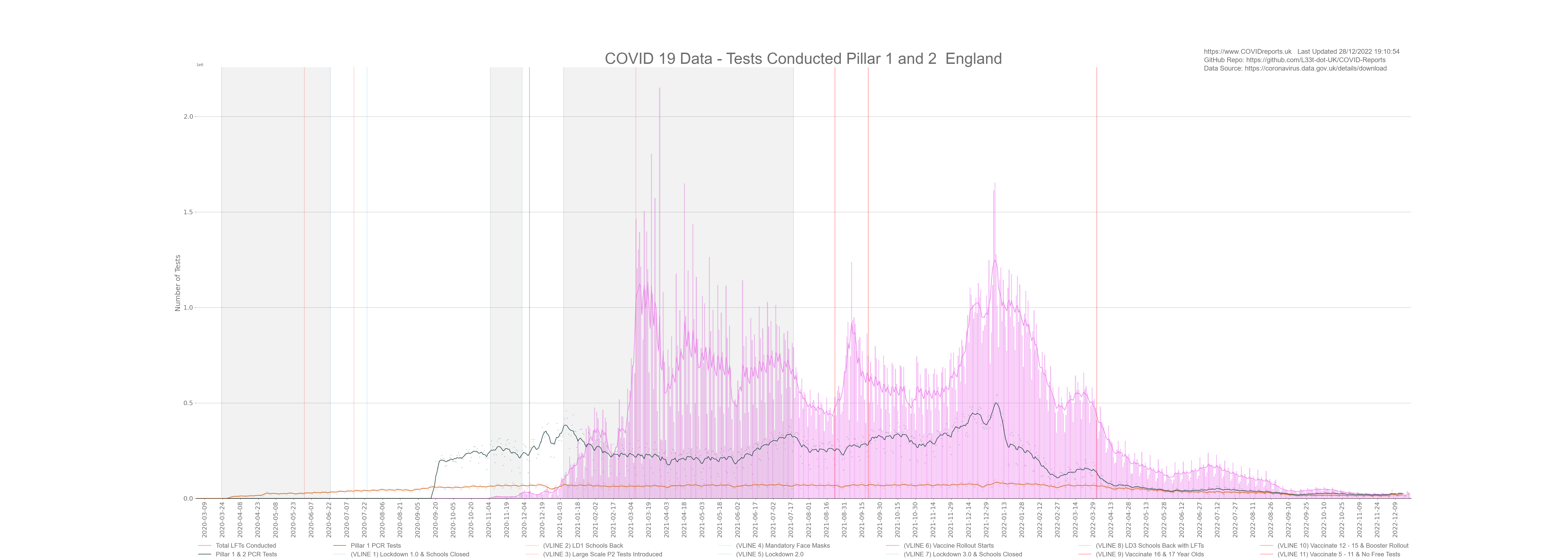
Looking at the data you can see when schools broke up for half term as there are clear dips in LFT tests being conducted during that time however we do not see a corresponding dip in PCR tests showing that LFTs are predominantly used in schools rather than PCR. With this said PCR are being used for school children who have been in contact with a positive LFT case meaning that although LFT have a low positivity rate they could still contribute to a casedemic environment through PCR false positives for contacts.
Factors Driving Testing
To understand testing and cases we must look at what’s driving what. Are cases driving the increase in tests or is the increase in testing driving cases. Now this might sound a little strange to some people however if you understand that no test is perfect and that PCR tests could be being misused to overinflate COVID figures due to false positives and the fact that PCR can detect fragments of COVID-19 rather than an active infection makes this test perfect to create an illusion of a pandemic. This was done in New York during the 2009 Swine Flu scare where they found cases everywhere with no corresponding increase in death or hospitalisation. COVID-19 affects the elderly more than the young which makes it difficult to correlate the data and come to any meaningful conclusion but we will try our best. The below graph shows cases, deaths and the positivity rate for both Pillar 1 and 2 tests.
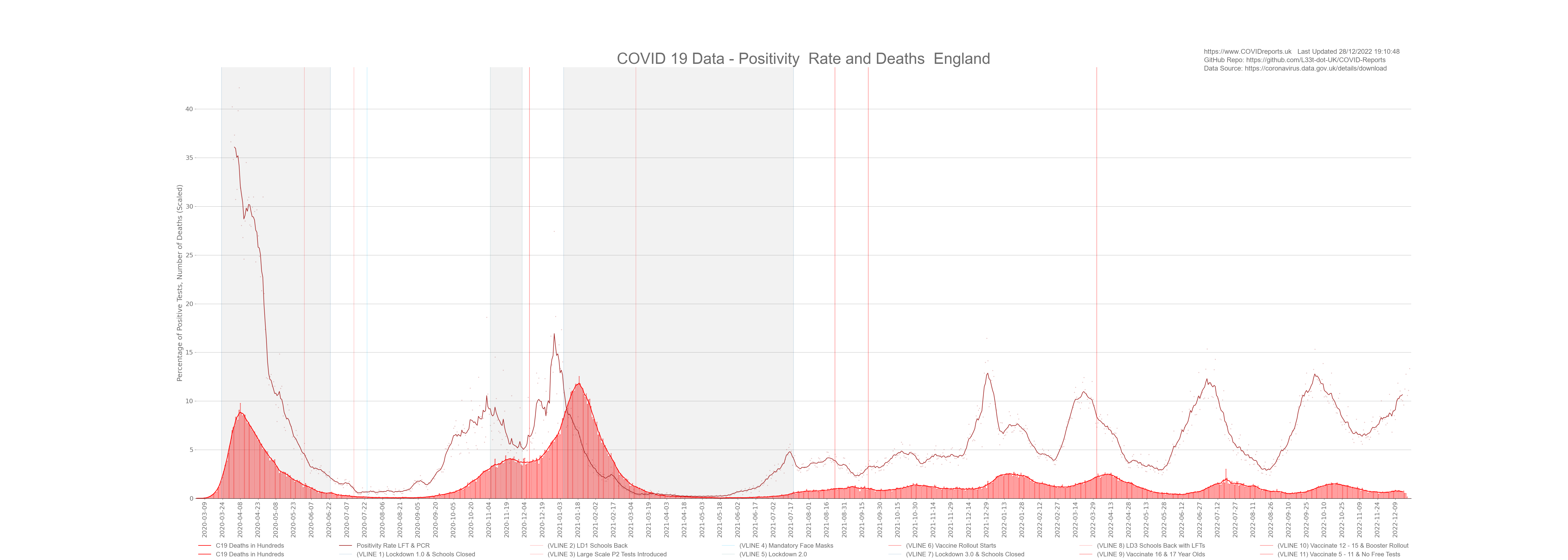
As you can see from the above graph cases and positivity roughly follow each other however, you can clearly see when changes to policy were made. For instance the positivity rate is very high during the first wave. This tells us that we were not testing enough people, daily deaths were greater than daily cases showing a lack of testing. Most of these deaths would have been diagnosed by symptoms and not test result. The second red vertical line on the graph shows us when large scale P2 tests were introduced. After this point positivity followed cases with a slight lag up to the 4th red vertical line which is when schools went back on the 8th March 2021. Testing policy changed on this day and they started large scale LFT’s in schools. since this point it appears that the positivity rate does not follow cases as closely as it did before.
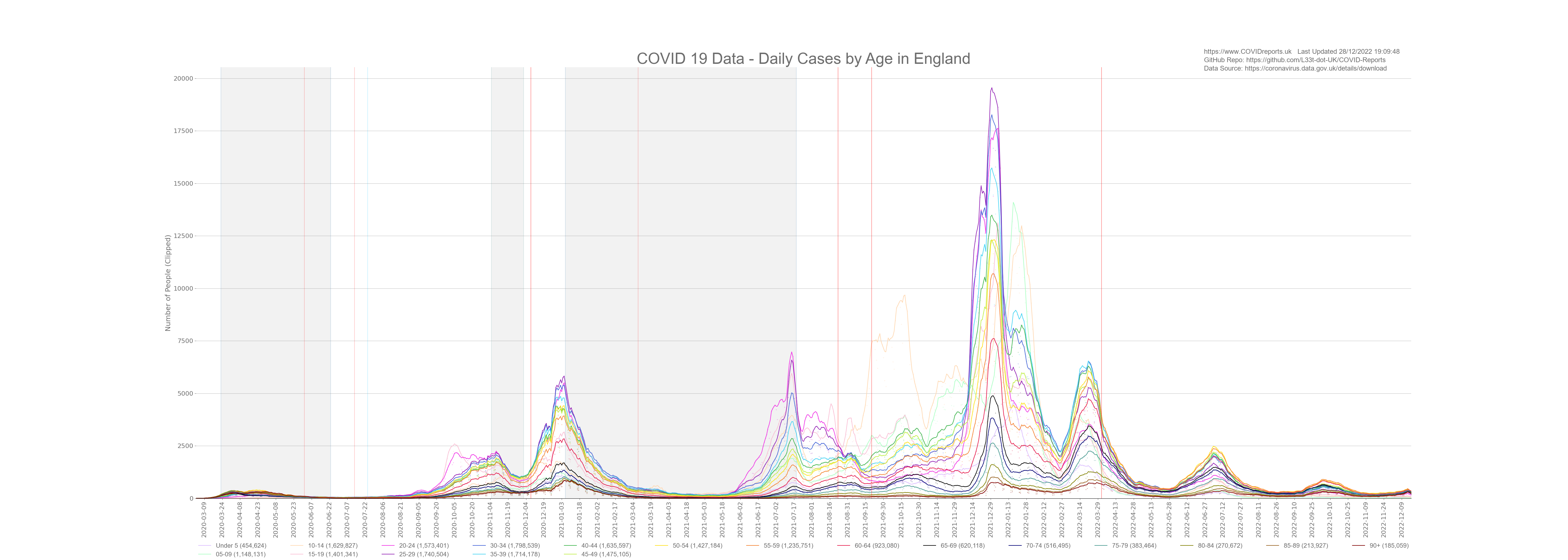
Another striking feature of this graph is that the number of deaths has not increased in a meaningful way during the 3rd wave. We saw a huge increase in cases but no corresponding increase in death or hospitalisation. Our government tells us that this is because of the vaccine however, after looking at the data it’s clear to see that this is because the vast majority of new cases are being found in the under 50’s who are not at risk. Even during the middle of July where all adult age groups are at least 58% vaccinated we still see an increase in cases predominantly in the under 50’s with no sign of an increase in death a clear sign of a casedemic.
What’s Driving What
Looking at the above graph it is clear to see that genuine cases drove the increase in testing up to the 8th March 2021. More positive cases meant that more people got tested. This could have been due to symptomatic people getting tested and due to people who have been in contact with positive cases being told to get tested by track and trace. By looking at the data we can’t see who’s getting tested (asymptomatic/symptomatic) however, we know that 80% of people will have no symptoms so we can safely assume that most tests will be carried out on asymptomatic people. Can we really call a case a case for an asymptomatic, non-infectious person? With that said we can see that although some of these cases will be false positives most were not as deaths followed the increase in cases with a slight lag with the exception of post September 2020 up to December 2020 and post March 2021; during this time testing was used to over inflate cases as we saw no corresponding increase in deaths.
During the middle of September 2020 increasing cases did not lead to a corresponding increase in death and vice versa, this was due to mass screening in schools and universities that led to cases in the younger age groups who were not at risk from COVID. We should be cautious when using tests for mass screening as it can skew the figures and lead to poor policy decisions such as lockdown 2 that started in November 2020.
The situation changed after the 8th March 2021. We can see a huge increase in cases with no meaningful increase in deaths. This is due to focused testing through both LFT and PCR of the younger age groups. We’re seeing huge increases in those age groups with no corresponding increase in death or hospitalisation. This shows us that we are in a casedemic environment with lots of cases and no meaningful consequences.
Now the reason for this is unknown at this point. It could be due to the vaccine protecting the vulnerable, it could be because we are over testing certain parts of society, it could be because the disease is endemic, it could be because doctors are not putting COVID-19 down as a cause of death for vaccinated people as they believe that the vaccine provides protection, vaccination could be driving cases. It could be for many reasons and from this data it is hard to come to a data driven conclusion.
Casedemic and Vaccination Post 8th March 2021
The summer of 2021 was very strange, in the middle of summer, cases were rising breaking the seasonality characteristic of this virus. With rising cases we saw very little corresponding rise in hospitalisations and deaths. The government say that this is proof that they have broken the link between cases, hospitalisations and deaths due to the vaccine. My take on it is slightly different where it looks like they are over testing parts of the population that are not at risk of death or hospitalisation and then using that data to show a weak association between rising cases and little to no increase in deaths. This is poor science from the government and they know it. The situation is simple; over testing younger people for a disease that is endemic in a population will result in rising cases. For a disease such as COVID-19 these cases in the young will result in little to no deaths. They then take this little to no rise in deaths as proof that the vaccine is working. Very poor science indeed.
I’m not saying that the vaccination has had no positive affect on deaths however, what I am saying is that we can’t attribute the current situation of high cases and little to no growth in deaths to the vaccine alone, during the summer peoples immune systems tend to be stronger and we must remember that we saw the same situation in September 2020 due to over testing. This was before the vaccine roll out and targeted 15 – 24 year olds. The government used those cases to justify a November lockdown that had little to no affect on deaths and hospitalisations however, we saw decreasing cases during the lockdown because people were not coming forward for tests as they were locked down and perhaps not in work. Death rates during that time period levelled out proving that the majority of cases post lockdown 2 were in age groups that were not at risk from COVID; a clear indication of a casedemic. The below graph is from the Cases and Deaths page that clearly shows lots of cases in the 15-24 year old age groups pre lockdown 2.
Conclusion
As you have seen it’s difficult to come to a definitive conclusion when looking at testing data. This is due to data skew after policy changes for pillar 2 testing which constitutes the majority of cases. It’s clear that an increase in cases have lead to an increase in tests, hospitalisations and deaths for the majority of time. This shows us that the spread of COVID-19 could have led to more testing. However after the 8th March we moved into a casedemic environment where the younger age groups make up most of the positive cases. This does not mean that those age groups are driving infection. We’ve seen that government policy can dictate where we find positive cases. The reason for slower growth in older age groups is unknown at this point and could be due to many factors such as the vaccine, cognitive dissidence, over testing of certain groups, etc.
With all of this said we must treat testing data with caution as the government refuses to have adequate quality control measures in its labs making it difficult to have a high amount of confidence when looking at the COVID-19 testing data in isolation. If we have high amounts of false positives it will show for both cases and deaths giving the illusion that deaths are following cases however, we do not have any concrete data that gives us the false positive rate for each lab so we can’t control for this in the data limiting its usefulness. Not only are we screening parts of the population for COVID-19, everyone going into hospital are also being screened for COVID-19 (by PCR) making the false positive problem much worse possibly skewing death figures too.
The British public should be very angry at this point. We have spent billions of pounds on testing and the meaningfulness of the data is limited due to governmental decisions. At this point we should understand COVID in a much more nuanced and meaningful way however, we don’t illustrating poor value for the tax payer as return on investment could have been much higher with better quality testing data. It’s as if the government wanted poor quality highly inflated testing data to nudge the population into compliance through fear. This story could have been different if we had better quality testing data, we could have found an intelligent way out of this much sooner.
![]()
![]()
![]()
![]()
![]()
![]()
![]()
.