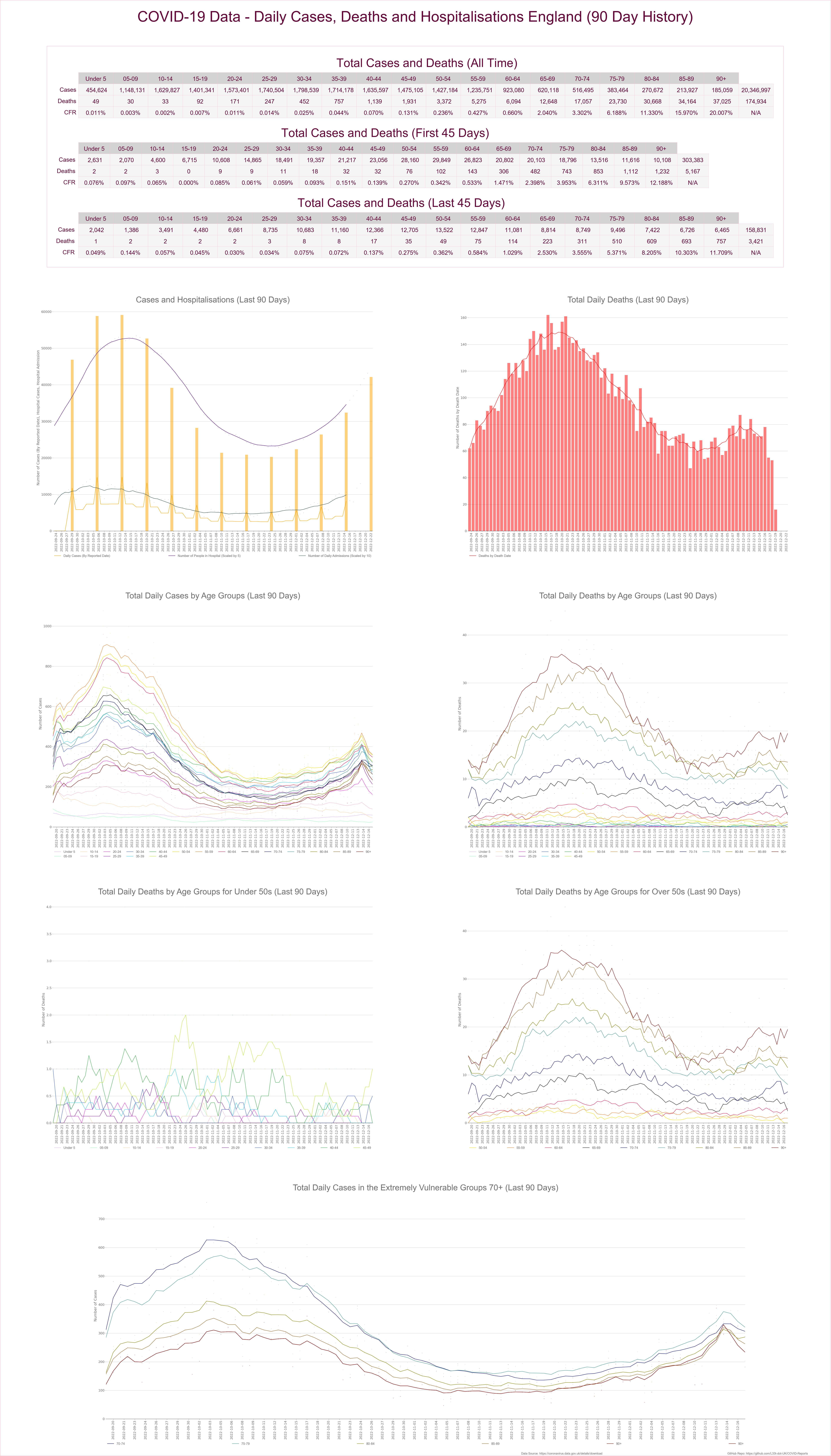
This Dashboard breaks down all cases and deaths by age. It also graphs cases, deaths and hospitalisations for the previous 90 days. I also display the data in tabular form breaking the time period in to two, 45 day chunks. This will allow you to evaluate the previous to current 45 days to make your own minds up about risks to yourself and family. I have added deaths for under and over 50’s at the bottom so we can track any noticeable changes to the death rate in younger people as vaccines are rolled out and in the older age ranges as cases increase. This will allow us to evaluate the risk and to know if we are entering a case-demic environment in low prevalence situations i.e. false positives driving cases with no corresponding death or hospitalisations.
