Example Code Snippets#
This document will contain some code snippets showing you how to use the COVID toolset. Before these sniipets will work you will need to ensure that all dependices are installed and you’ve imported the relevent classes. To see how to do this go to the getting started page of this documentation.
All code examples can be found in the examples folder for this project and ran by pressing F5 in Visual Studio Code)
Note
I recomend that you use the virtual environment found in the venv folder as all depencies are installed ready to use. If you don’t use this and need to install the correct depencies go to the getting started page to see what these are.
Charts can be constructed using either lists or dataframes, for more on this see the LoadDatasets documentation.
Warning
When creating charts ensure that you use the correct y-axis values, for age profiled graphs you should be using get_aged_gov_date_series and for non age profiled graphs you should be using get_gov_date_Series from the LoadDatasets class
Downloading COVID Data#
This toolset links into the UK Governments COVID API allowing you to download COVID-19 data automatically. To do this you need to create a GetCovidData object. The creatation of this object will pull required data and save it to csv files in /data/autoimport. The below code shows how to do this:
from toolset.GetCovidData import GetCOVIDData as getData # Import the class
nation = "England" # Select the nation you want data for
pullData = getData(nation) # get the latest data
Note
Data will be saved in 2 csv files one named data + nation.csv and the other named dataAge.csv. If you select a different country i.e. Scotland dataAge will still be downloaded however it will contian data for England and not Scotland. Data.csv will contain data for the selected nation. Aged profiled data is only available for England at this time.
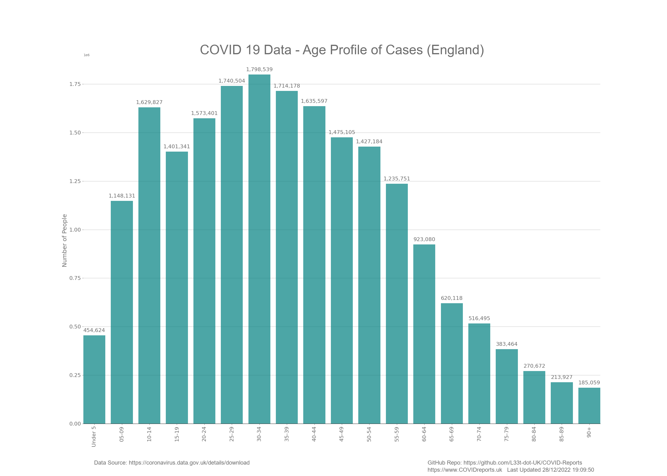
Creating a Bar Chart#
Bar charts are bar graphs without a line of best fit and they can have the amount of each bar shown at the top of each bar. These are useful when showing data for a short period of time or summed up data.
from toolset.LoadDatasets import LoadDataSets as govDataClass
from toolset.CovidChart import CovidChart as CovidChart
import numpy as np

nation = "England"
govData = govDataClass(True, nation) # create the LoadDatasets object and load the data
chart = CovidChart() # create the CovidChart object

chart.set_chart_params(False,False,False,True) #Change params we dont want the VLINE legend
chart.clear_chart()

totData = [0]* 19

for ii in range(0, 19):
    data = govData.get_aged_case_data(ii) #Gets new cases
    totData[ii] = np.sum(data) #sum up cases in each age group

chart.add_bar_chart(govData.get_age_cat_string_list(), totData, "teal")

chart.draw_chart("Age Categories", "Number of People",
    "COVID 19 Data - Age Profile of Cases (" + nation + ")", "BarCases", False) #create the chart
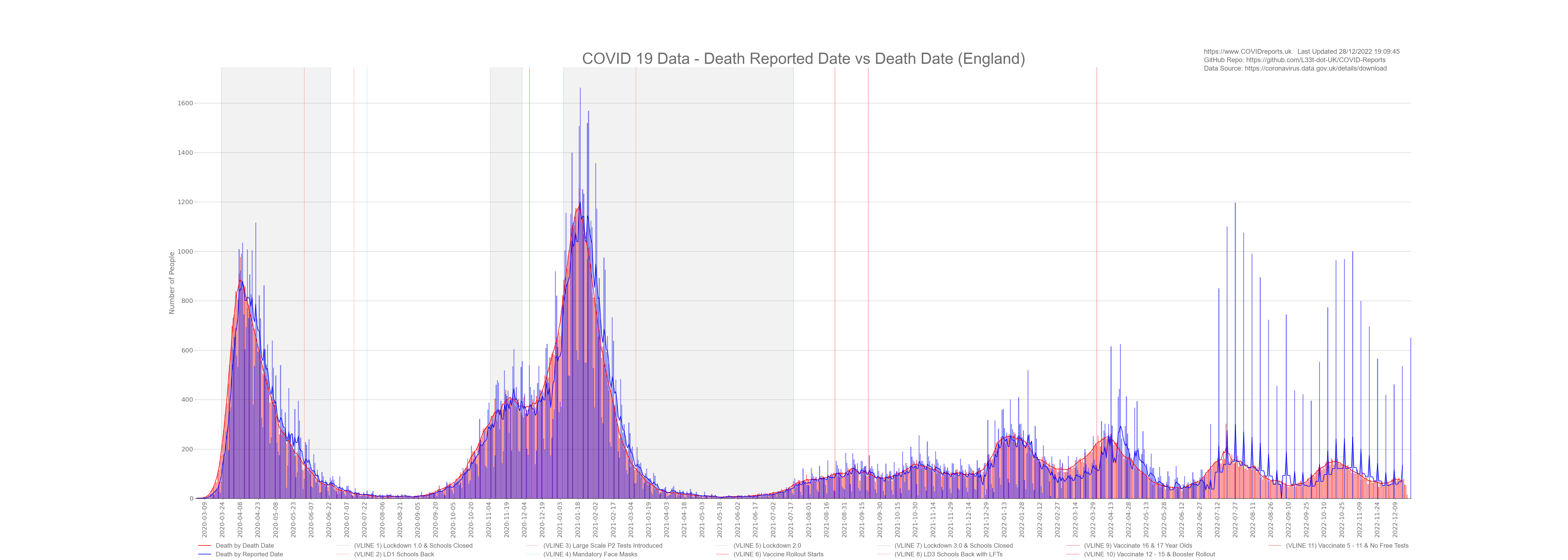
Creating a Bar Plot#
A bar plot is the same as a bar chart without the amount shown and a linr of best fit added
from toolset.LoadDatasets import LoadDataSets as govDataClass
from toolset.CovidChart import CovidChart as CovidChart

nation = "England"
govData = govDataClass(True, nation) # create the LoadDatasets object and load the data
chart = CovidChart() # create the CovidChart object

# These params will ensure that the chart is not shown, VLINES are added,
# a legend is added and time stamp is added.
chart.set_chart_params(False,True,True,True)
chart.clear_chart() #first clear old data from the chart

data = govData.get_new_deaths() #Gets new deaths by death date
chart.add_bar_plot(govData.get_gov_date_Series(), data, "red", "Death by Death Date")

data = govData.get_deaths_by_report_date() #Gets new deaths
chart.add_bar_plot(govData.get_gov_date_Series(), data, "blue", "Death by Reported Date")

chart.draw_chart("Date", "Number of People", "COVID 19 Data - Death Reported Date vs Death Date (" + nation + ")"
            , "deathsAndDeaths", True) #create the chart
Creating a Scatter Plot#
A scatter plot is a plot with points added and a line of best fit between the point. The points that are plotted are faint and the line of best fit is less faint. The averaging time for the line of best fit can be changed, it’s default value is 7 days.
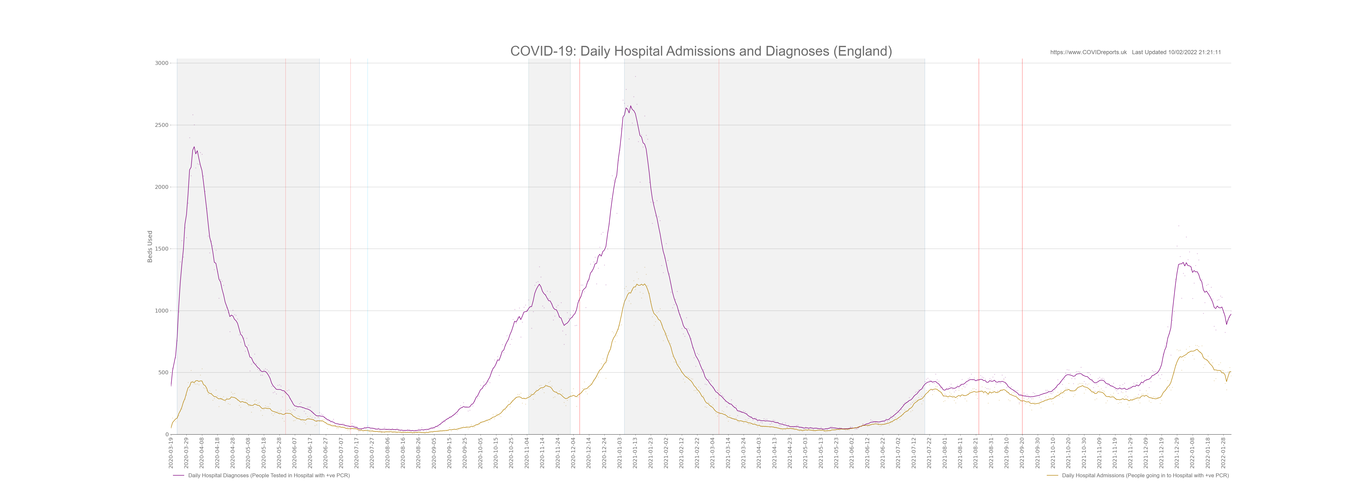
from toolset.ReadHospitalData import readHospitalData as HOSPITALDATA
from toolset.CovidChart import CovidChart as CovidChart

hospitalData = HOSPITALDATA()
chart = CovidChart() # create the CovidChart object

#First load the datasets and join them as these are in different excel files
hospitalData = HOSPITALDATA()
chart = CovidChart() # create the CovidChart object

def addEnglandToChart(df, colour, label, to_dash):
    df = df.reset_index() # remove dates as the index
    chart.add_scatter_plot(df["Dates"].tolist(), df["ENGLAND"].tolist(), colour, label, to_dash, False)

chart.clear_chart()
chart.set_chart_params(False, False, True, True)

df1 = hospitalData.join_totals_datasets("data/hospitalData", "Admissions Total")
df2= hospitalData.join_totals_datasets("data/hospitalData", "Diagnoses Total")

addEnglandToChart(df2, "purple", "Daily Hospital Diagnoses (People Tested in Hospital with +ve PCR)", False)
addEnglandToChart(df1, "darkgoldenrod", "Daily Hospital Admissions (People going in to Hospital with +ve PCR)", False)

chart.draw_chart("Date", "Beds Used", "COVID-19: Daily Hospital Admissions and Diagnoses (England)"
                                        , "HOSDATA_AdsDiagnoses", True, hos_data = True)
Example using lists:
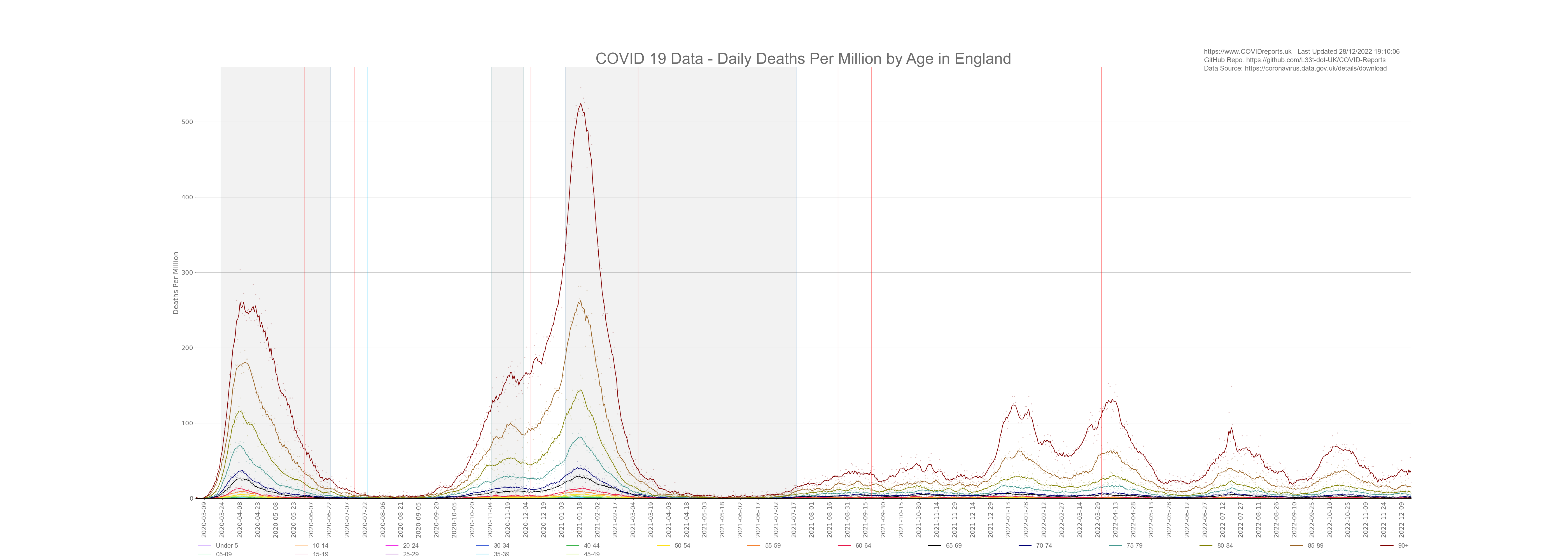
from toolset.LoadDatasets import LoadDataSets as govDataClass
from toolset.CovidChart import CovidChart as CovidChart
from DataFunctions import Functions as functions

nation = "England"
govData = govDataClass(True, nation) # create the LoadDatasets object and load the data
chart = CovidChart() # create the CovidChart object

chart.set_chart_params(False,False,True,True)
chart.clear_chart()
funcs = functions()

for ii in range(0, 19):
    data = govData.get_aged_death_data(ii) #Gets new cases
    permillionData = [0]*len(data)
    permillionData = funcs.calc_time_series_per_million(data, ii)

    chart.add_scatter_plot(govData.get_aged_gov_date_series(), permillionData,
            govData.get_line_colour_list()[ii], govData.get_age_cat_string_list()[ii],
            False, True)

file_name = "ageDeathsPerCapita" + "0" + "_" + "19"
chart.draw_chart("Dates", "Deaths Per Million", "COVID 19 Data - Daily Deaths Per Million by Age in "
            + nation, file_name, True)
Creating a Treemap#
Treemaps are great for displaying data that can be summed up to show new insights that time series graphs don’t show.
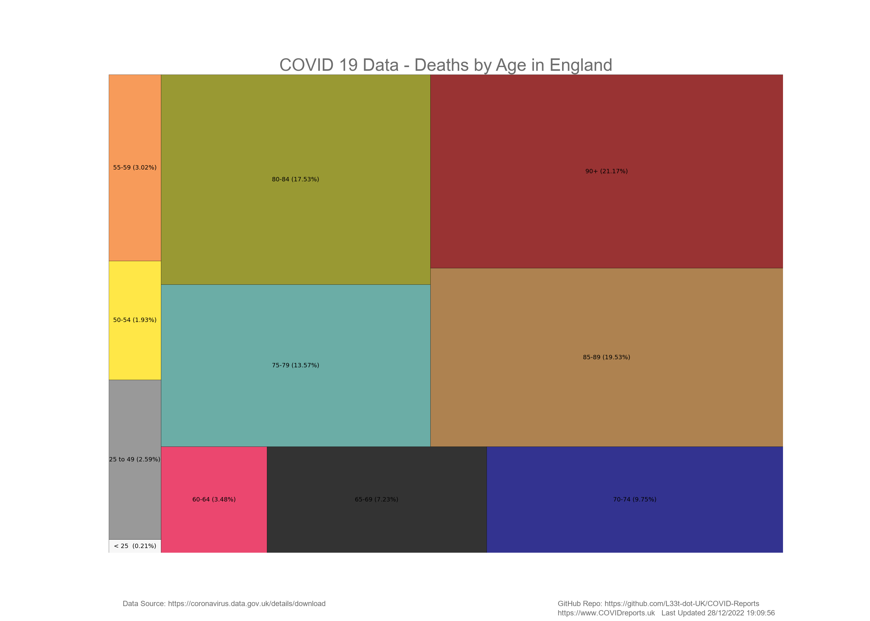
nation = "England"

from toolset.LoadDatasets import LoadDataSets as govDataClass
from toolset.CovidChart import CovidChart as CovidChart
import numpy as np

govData = govDataClass(True, nation) # Create the LoadDatasets object and load csv data into it
chart = CovidChart() # create the CovidChart object

chart.clear_chart() #Clear the chart object
chart.set_chart_params(False,False,False,True) # Change params of the chart

# We're taking time series data and summing it up to create the summed data for
# the tree map using lists
summedData = [0] * 11
ageCats = [0] * 11
colours = [0] * 11

# I'm now creating 2 new categories for the under 25 and under 50 age groups
ageCats[0] = "< 25 "
colours[0] = 'whitesmoke'
ageCats[1] = "25 to 49"
colours[1] = 'gray'
for ii in range(0, 5): # All under 25
    summedData[0] = summedData[0] + np.sum(govData.get_aged_death_data(ii))

for ii in range(5, 10): # All under 50's
    summedData[1] = summedData[1] + np.sum(govData.get_aged_death_data(ii))

for ii in range(10,19):
    ageCats[ii - 8] = govData.get_age_cat_string_list()[ii]
    colours[ii - 8] = govData.get_line_colour_list()[ii]
    summedData[ii - 8] = np.sum(govData.get_aged_death_data(ii))

chart.add_treemap(summedData, ageCats, colours) #Add the data to the tree map
chart.draw_chart("", "", "COVID 19 Data - Deaths by Age in " +
                        nation, "TreemapDeaths", False) # create the chart
Another example using dataframes rather than lists:

from toolset.ReadHospitalData import readHospitalData as HOSPITALDATA
from toolset.CovidChart import CovidChart as CovidChart

#First load the datasets and join them as these are in different excel files
hospitalData = HOSPITALDATA()
chart = CovidChart() # create the CovidChart object

# Get all data from the admissions Total worksheet
df1 = hospitalData.join_totals_datasets("data/hospitalData", "Admissions Total")

# Get all data from the diagnoses Total worksheet
df2 = hospitalData.join_totals_datasets("data/hospitalData", "Diagnoses Total")

totalAdmission =  df1["ENGLAND"].sum() # sum up the admisison data
totalDiag = df2["ENGLAND"].sum() # sum up the diagnoses data

# add the above data to a treemap
chart.add_treemap([totalAdmission, totalDiag], ["Admissions", "Diagnoses"], ["blue", "red"])
# draw the treemap and save to file
chart.draw_chart("","","Hospital Admissions vs Diagnoses", "Example_TreeMap", False)
These examples are here to get you started with the toolset, for complex examples showing how to use all of the toolsets features go to the Python files in the src folder and see how they’re written.
For support or bugs you can find me at Dave at L33T dot uk